Wednesday, December 27, 2006

The colors...

I've always been an Illustrator man.
The tightness of the edges and the endless scaling possibilities. I usually streamline my inks and color the whole shebang in Illustrator. But over recent months I've been admiring the works of people like James Jean and Asaf and Tomer Hanuka and I've been flirting with the idea of maybe *gulp*...switching.
I know, I know, I can just use both, but where's your sense of drama!?
Anyway I wanted to try coloring one of my illustrations in Photoshop, but I don't have much experience with it. I have, of course, been using photoshop for years, doing all kinds of odd jobs (scanning, retouching making images ready for prints etc.), but never actually for illustrating. I had made some failed attempts before but they were... well failed. This time I wanted to make real go of it.

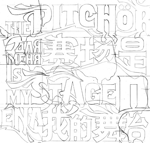
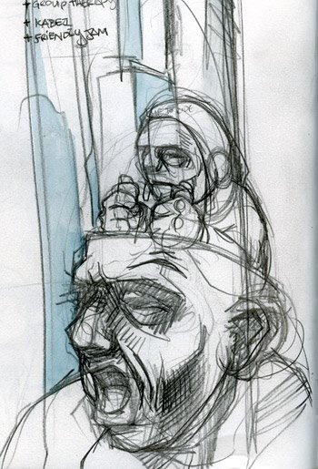
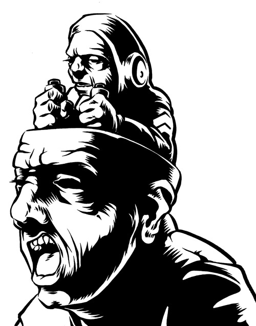
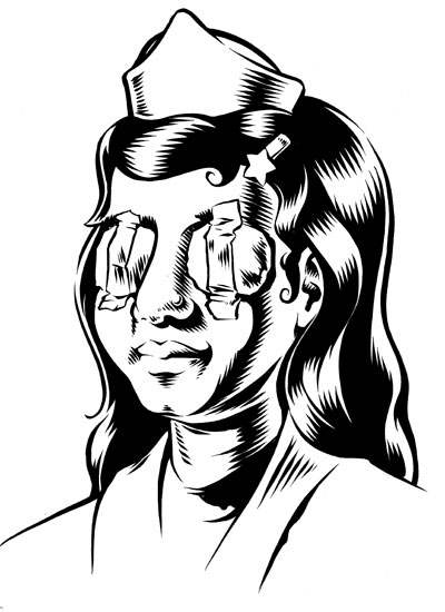
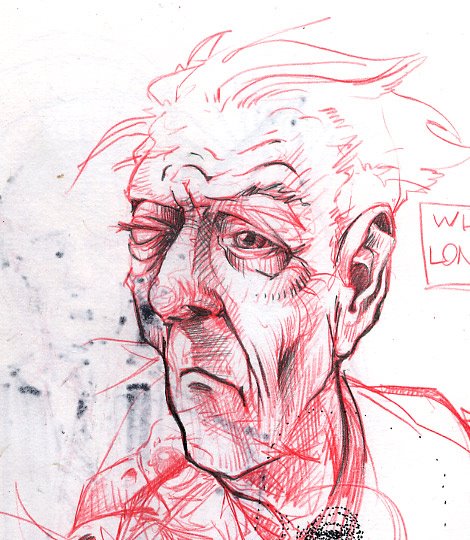
A nice opportunity arose when one of my illustrations was deemed "too heavy" by the client after I had already inked it (some mix-up about the meaning of the words "sketch approved"). It was the style drawing I wanted to color because it was kind of realistic. For the more cartoony stuff I still like the flat tightness of illustrator.

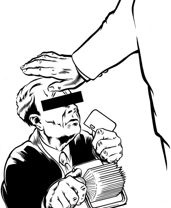
Quite a few artist who use photoshop don't even ink their art, but use really clean, partly shaded pencils. I might try that at some stage, but I really like inking and I don't want to loose too much of the clean tightness that comes with good ink.

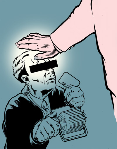
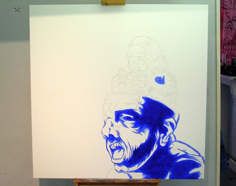
I didn't know where to start but I just went about it the way I would do a painting (with paint and brushes and stuff). So that meant the big shapes first. As with most of my experiments, I put in exactly 0.0 planning. So I made up the colors as went along... which is why they're not the most interesting of color schemes.

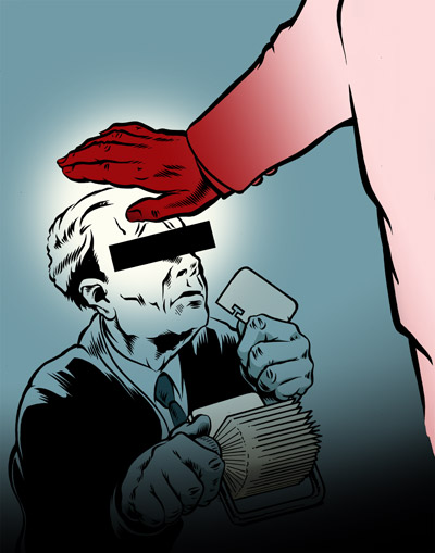
After the big gestures, start adding more and more of the smaller details.

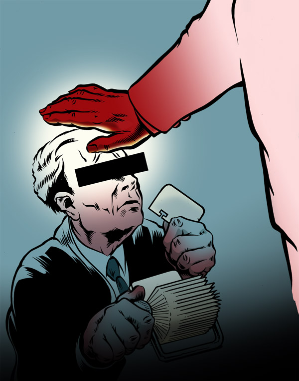
And that's where I decided to call it a day. I could add more detail, change some colors, redo some of the renderings, but as far as the experiment goes I think it's quite a successful one. I really want to get into this some more and also do a couple of 'professional' pieces. Although that's where I bump into one of big disadvantages of Photoshop... pixels. Which means none of that nifty infinite scaling that vectors offer. So that means thinking ahead a bit better and maybe buying a few more GB's or RAM.

Saturday, December 23, 2006

MY ADIDAS!

Father, it's been 2 months since my last confession... I do apologies.
In June of this past year I was approached by the 180 advertising agency in Amsterdam to help them out with the some custom typography for one of the campaigns the were working on. I went into their offices to be briefed (and sign a bunch of NDA's) and what I thought was about a 2 months worth of work turned into and almost al consuming project of a good 6 months.
They wanted me to do some custom lettering for the Adidas football boot campaign.
It meant having to design and draw two pieces of typography in (what became) 24 different languages... These included next to most western languages, Chinese, Japanese Arabic, Russian and Korean.
It was an offer I couldn't refuse so I went at it with all I had and the first applications are now being shown to the public....


The campaign was developed to promote the latest edition of the Adidas soccerboots; the Predator and the F50.
The Predator is a the shoe for the methodical, tactical, technical player whereas the F50 was designed with the more flamboyant, fast and playful player in mind. The concept behind the campaign was based on the idea of these shoes representing two different teams, the punch-line being "Two team,two attitudes, choose your side". This had to be reflected in the type.

(Click the image for a closer look)

The type was based on two existing type-faces. One being the Flix and the other one the Cuba (a horribly cheap and crappy product and therefore needed a LOT of work before it was of any use). The reason for this was that they wanted to have other supporting typography in a similar style but were too cheap to let me design two faces from scratch... it wasn't that really, it would've just taken me too much time.


This is one of the first applications of the campaign. This one is in Germany and similar so-called 'mega-sites' will also be done in Brazil and Honk Kong. My typography is part of the print campaign. To check the commercials and other part of the whole thing check the Adidas website.

Sunday, October 29, 2006

Sneaker Tweaker

Well I have arrived... I finally did just about the hippest thing (or so I'm told) one can do as an artist nowadays.
I cuZtomized a shoe... a sneaker to be exact.
I was asked, together with my friends from StayGold and a guy called Jill, by the organizers of a little art/culture festival called 'Stoelendans' to come and sit in the middle of a dance-floor and doodle on shoes.
It was great fun. The venue was a club that during the day is bar/restaurant and then turns into a throbbing dance/booze/sex extravaganza at night. We were there during the day... rats! As I said we were in the middle of what at night is the dance-floor on couches which was nice enough... apart from the lighting.

So it was really hard to judge the colors... I decides to stick to black, white and red straight from the can.
This was the first time I did this so it was a little bit scary to take a sharpy to some-one else's brand-new virgin white sneaker at first, but my old vandalizing tendencies from my graffiti days came flooding back to me soon enough.
I did take my time though. Jill, a newly befriended veteran shoe-customizer (the guy next to the empty spot on the couch) only did one half of the pair... so he got to do a lot more shoes. He wasn't to concerned with details neither. Big, bold shapes, two colors, real block-buster style. Great work! And a good lesson for me, if I ever get to do it again: don't sweat the small stuff.

The first pair took me most of about 2,5 hours... masking, spray-paint, thinking, doubting, hesitating, some drawing, do a few high-lites and then multiply that be 2 and here's the result.

The second pair went a bit faster. I did them for a girl who wanted something not too 'big' or 'heavy'.
I did simple little ornaments in silver and black, with a flower and a bee on the noses of the shoe (sorry for the blurry inset, something must have gone wrong with the flash I guess)

Anyway it was a lot of fun. A friend of mine to do his classic Adidas shell-toe high-tops, that he never wears (so "I might as well hang them on the wall"). When I finish them I'll post some pics on here too...

Wednesday, October 25, 2006

Growing paints

First off, excuse me for the title of this post, but I wanted to share some pics of a painting I'm working and the thing has been in development for a while. Ahh, I remember as though it was a day ago... (imagine the wobbly flash-back effect here).
It all started with a sketch I did in one of my sketch books a couple of years ago, which looked like this:


Nothing further was ever intended to happen with that sketch then to just sit there in the sketch book... But then I got an e-mail from Mark Beemer of Shirts for a Cure, a charity organization that offers financial aid to women with breast cancer and poor health insurance (check out the website), for whom I had been designing t-shirts for quite some time (I still do). He asked me if I was interested to do a design for the band The Draft and I happily obliged.
So I inked the thing and made design for the shirt.


I did several designs the band decided to donate another design to Shirts for a Cure and use this one for themselves, for a small buy-out fee.
By then I had grown quite fond of the thing and the idea of doing it on a larger size sprouted somewhere in the back of my mind. I hadn't really worked on any decent sized painting since my college days and really needed to stock up on supplies and equipment. I got an easel from the basement of my girlfriend's granny's basement and I bought some new brushes and acrylics. I considered oils, but I'm working in my house now and I don't want to stink up the whole place. All I needed was a way to get the inked piece on blown up to the size of the canvas (100x100cms). I found an overhead projector on the Marktplaats (the Dutch local e-Bay), so I could finally start working on it.


After I penciled the illustration on the canvas, I did a base color using ultramarine blue before I started painting. It will end up a different color but whatever that is going to be (probably black) this will make it a nice and deep dark color.
By this point I really didn't have clue of what I color I was going to paint the rest of the thing, so after I had finally finished the base color the painting was not much more the a annoyingly big thing in the middle of my room for about 4 months.
Then I decided to just fill in the background with a transparent red basecolor, to give whatever color that goes over it some depth. I don't have a picture of this. I took it, but misplaced.


Anyway another 3 months and a move later there has been some development. I'm still not completely sold on the colors and the background. The little controller guy should become more fiery and the zombie has to be more greenish, more the color of oxidized copper. I'm pondering the possibility of a pattern in the background... but not sure yet.
It's nice to just let the thing grow as I go. It's a good to surprise myself which makes it fun.

Friday, October 20, 2006

Flat bodies everywhere....

Well after a bit of radio silence ("It's madness at the office, honey, sorry I'm late") I think I should post some more sketches...
Since my last sketch post (in which I realized that I mostly draw faces) I consciously focused on drawing bodies more. And also try to put them into sort of interesting position. I found that it's something I REALLY have to work at and I'm going to do some live figure drawing classes. Because as every good artist knows there's nothing that will hone your skills sharper then drawing flabby naked 'eccentric' people from life. Anyway...

The far arm is too flat and not in the right place... nor is the far leg for that matter....

I also really need to actually do some drawings with more full bodies, instead of just sketches.

Ok this one is mainly a face but I liked it anyway...


I wish I had paid more attention when I was still at arts college, but since I did graphic design, figure drawing and painting was only a small part of the curriculum. If only I could do it all over again...
As soon as the live figure-drawing classes start I'll post the results on here.

Monday, October 02, 2006

Work in progress continued...

So I finally got some hours scrounged together to work some more on an illustration that had been on the table for quite a while.
It had inked the main characters in this piece, but I was still trying to figure out what to do with the rest of the space. It's not the first time I got impatient and started inking before the whole drawing was finished, but it's a habit I really have to kick.
The think turned out a bit busy which can be toned down when color, but I initially didn't want to use color and now I have to... rats.


There was a lot sketching before I decided to keep it 'simple' with just the beams of light and the condensation coming off the robot and the guy being fried, just like in the sketch. I had also considered putting trees in the background and plants in the foreground but that would just be to much. More for even color to help out with.
Now all that's left to be done is the type... There's going to be a big "BLAM" or "BOOM" or even a "ZEEEEEEEE" over the top of the scene... Any suggestion for better sounds please send them to me.

Sunday, September 24, 2006

Blind Girl's Bluff

Well as promissed here's a posting on the development of the Blind Girl's Bluff illustration.
It's the third in a series of pieces that I've been working on for quite some time now. The first two I finished about 3 years ago, so this one has been a long time coming. For the first two check my previous posting.


The level of detail on these is quite high so I had to ink the different parts seperately and re-assemble the thing in illustrator.


Since this is going to be blown up to a large size I'm going to have to convert this bit to vectors by hand. I sometimes use Adobe Streamline to convert the scans to vectors but this needs to be tight all the way up to the 110 x 145 cm of the final size.


This skull is only going to be little ornament at the top of the composition and only about a third the size of the portrait of the nurse. So that's why I couldn't fit all of it on one piece of paper. And even if I could, scanning that bastard would be a real pain in the ass on my little A4 Epson scanner.


The lettering is always a fun part to work on. Here I did a sort of faux-sanscrit roman to help hint at the cultural background of our leading lady.


Most of the different elements have been inked and scanned. I'm about half-way through vectorizing the scans, and then I can seriously start coloring it. I already did some tests but that jealded nothing satisfactory.
Anyweay I'll keep you posted on the progress.

Saturday, September 23, 2006

Todays Art

This weekend there was a big art festival going on in The Hague. All kinds of performances, films (projected on the sides of buildings) installations, visual arts, dance sculpture etc. are being displayed all around the city. Basically exactly what you would expect from an art festival.
I was asked by one of the organiser if I had some work I could show. And I had some lying around, but the finished result of my work is always a digital file. So granted it wasn't exactly lying around, bu tI had some. So we decided to have it printed on big-size printer. The prints came to 110 X 145cm. I would have liked them to be even bigger but that's as wide as te printer would go.

These illustrations aren't really all that recent. I did them a few years ago, but the public hadn't really been exposed to them so I thought it was ok to get them out.

There's a few more of these weird kids on the way. Right now I'm working on a blind nurse with a seeing-eye cat, and there plans for two more brewing.

I'll show some of the progress on that nurse on the next episode of the BOLTblog.
'Till then, in the words of the legendary Don Pardo: sweet dreams and happy tomorrows...

Wednesday, September 06, 2006

Digging for type....

Every type -nut (and you know who you are) is familiar with the dusty smell of old secondhand bookstores. Every type-nut (go on, it's ok to admit it) knows that special feeling of when they find that little book or card or poster that will soothe their craving just long enough to last untill the next visit to the bookstore/market/attic. Every type-nut (yes you are) will always be a type nut....So I was on my knees going through the bottom shelf of the typography section over at my local bookpusher, when I came across the book "Lettering Today" by John Brinkley.
Published in 1963 by Studio Vista, it shows a whole range of hand-drawn type and calligraphy by mainly European designers (among others Gerrit Noordzij, Max Caflisch, Chris Brand and Hermann Zapf). It was just what the doctor ordered to still my hunger...
Here are few hits.

Bookjacket by Hans Tisdall (original in several colors)


Bookjacket by Hannes Jähn (original in red and black)


Book jacket by Herbert Lindgren


Not sure but I'm guessing this one is by John Woodcock, another book jacket


Lettering for a book jacket bt Frau Inge Gack


Three elegant little bookplates by Will Carter, Will Carter and Francis Minns respectively.


It's awonderfull book get it if you can, it's full of wonderfull type and lettering. Apart from where is veers of into some hideous viny-plotted seventies signage... Anyway keep your browser locked to this station because I'll most likely post more of this stuff in the future.

Tuesday, September 05, 2006

Faces

For some reason I never doodle doodles anymore.
When I draw without thinking I draw heads and faces. Usually they all look alike which is very annoying, but sometimes some gems pop out. Here are some of the shinyer ones.


I use red and blue pencil for everything (not just drawing) mainly because it doesn't smudge or get your hand (as) dirty.


Are you starting to notice a pattern yet?


I think I should force myself to try some different angles.


Wasn't that riveting?
And imagine these were the more shiny gems... imagine the blandness of all the other crap I fill my sketchbooks with.
Next week... drying paint.

Sunday, September 03, 2006

Here goes....

Well this is the first posting. I'll try and get this as interesting as possible...
Lately I've been working on this illustration the image of which had been floating around in my brain for quite a while.
About a month ago I finally got it sketched out, on to paper and out of my head. Ever since then I've been trying to work on it in between commissioned work (which has taken up most of my time).

Here's the first rough sketch...


Based on this I did a slightly tighter blue-pencil.


But when I wanted to start on the robot I didn't really know what it shoud look like. So I went back and sketched out the robot first, added it and inked it.


On uncomissioned pieces I tend to go back and forth between inking and pencilling. I would pencil and add stuff after other parts were already inked. I'm still trying to decide if I'm gonna put a foreground and/or a background to this. I'm pretty sure it's going to have type although again I'm not sure what... I think a big "BRRRRRRRR" or "BZZZZZZ" over the head of the robot.

I'll keep you up to date on further developements...