...for now.
The site is back online. Fingers crossed it will stay there.

Sunday, December 30, 2007
Friday, December 28, 2007
Great start...
For those who haven't noticed yet, my main website (boltgraphics.com) is down.
The guy who hosted it decided to take a vacation and forgot to pack his brain or something. He says he made a deal with another comany that they would keep his servers in check, but they say they don't know nothing about anything....
In the meantime I'm screwed. No e-mails, no website, no webstore, no nothing... wel there is this blog.
So please people, don't be alarmed. I'm still here, don't panic and sit tight, I'm working on it and will be back with you shortly.
Thank you for your patience....
Cheers,
Martijn
oh and a happy new year!!
Thursday, November 29, 2007
Britannicus
A while ago I was asked to do a bit of art on an almost blank poster. As part of an art-project build around a run of performances of the play 'Britannicus'. The whole thing was thought up by my good friends, the Stone Twins.
The play is about Nero, the Roman emperor and also one of the most sadistic tyrants the world has ever seen. So the theme of the play (and the poster) was power... and the abuse there of.
See if you can find all the little hidden messages.

The play is about Nero, the Roman emperor and also one of the most sadistic tyrants the world has ever seen. So the theme of the play (and the poster) was power... and the abuse there of.
See if you can find all the little hidden messages.

Tuesday, October 23, 2007
I did it all for the 'Nouky
Every once in a while you get a call from a potential client and from the very first words they utter you just know it's going to be a nightmare.... Especially when those words are:"Do you work on a 'no cure no pay' bases?"
This time it was EMI (remember them, from when you had to buy music from a shop). It concerned the artwork for the upcoming release by Anouk, one of Holland's biggest selling artists. They were obviously shopping around for cheap and eager designers. As it turned out the only two they were trying to snare were the guy who I share a studio space with (Shamrocking.com) and me. And unlucky for them we are neither cheap nor eager (not eager to work for the major music-industry anyway). To cut a long and for EMI somewhat embarassing story short, we decided to do it together (Shamrock took the job and I would help him out as he didn't have too much time).
HRH Anouk's manager (a nice guy, it has to be said) came by to tell us about the feel they were looking for. He was talking about religious (catholic-) imagery used in southern Californian and Mexican Latino cultures and we, quite entheusiastically, jumped in with all kind of ideas fo ourselves...
First priority was the artwork for the first single "Good God". EMI kept insisting we show them 5 different completely worked out proposals for them to pick and choose from... well we told them that that's just not the way we (or any other designer we know) work. So we gave them two proposals plus a presentation of collages (or mood-boards if you will) to show what kind of feel we had in mind for the rest of the campaign (album, posters, dvd etc.) Anyway this is what we did... keep in mind all this was of course on the tightest of deadlines.. (3 weeks ago).
This was Shamrock proposal for the single art...

This was mine...

And these were some of the collages for the rest of the campaign...


They picked my design and really liked the ideas we had for the rest of the stuff....
So I started on finalising the art-work for the single. The only thing they wanted me to change for the finals was the color of her face... I thought the silvery look was kinda cool (remeniscent of old silver statues in catholic prosessions), but they wanted her face to look as young as it could... (she is in her forties so I understand her insecurity).
Made the required ammendments, made the deadline, job's a good'un.

Or so I thought...
The day after the deadline. We get word from EMI (Shamrock had all the client contact go through his agent at this point because we didn't want to deal with the bullshit anymore): "She want's her hair to be more visible. Could I move the picture over a bit?" O...K.... I had to make the type a bit smaller for that too:

So that's surely it...isn't it? Oh no it ain't!
"Don't like the logo touching my face... and it's covering too much of my hood" This is seriously what she said.
Anyway (I was getting on my hourly rate by now, let me assure you):

And upon seeing this, HRH found those ornaments too distracting and why not take them out all together..
Well I stopped caring two versions ago so I just started the clock again...

So finally that was it... the bitch was happy and I was done. During all this she also decided that she wasn't going to (ab)use us for the other artwork. I didn't care really because these types of jobs give me flashback of the years I used to work for a boss and I hated those years...
So a few weeks go by and I start to wonder when this thing is finally going to be released upon the populace... so I checked her site and to my ashtonishment:

So here's a call to all budding young designers: Don't let them screw you around. They are used to people jumping at the chance to design something 'high-profile' and this is why record companies aren't used to paying decent fees. So make sure you do get paid right (which luckely I did) because it's not like they don't have the cash... they just don't want to spend it on you.... the bastards
Tuesday, October 16, 2007
Sketchbook exhibition
On de 2nd of November there will be an exhibition hosted by my agency Shop Around. They asked all the illustrators to scan some pages from their sketchbooks and send them in. They'll be printed and then shown at Kunstcafe Gommers.
I send in 5 scans, some of which have already featured on this blog.
Read the flyer below for more details. (if you can't read it... click the thing for a closer look...duh)

I send in 5 scans, some of which have already featured on this blog.
Read the flyer below for more details. (if you can't read it... click the thing for a closer look...duh)

Thursday, October 11, 2007
Shirts...
As my website and new corporate identity design is nearing completion, I'm also working on some new t-shirt design to accompany the beg launch of it all (no date set as of yet, but will be soon enough). And I know this isn't very professional, but I want to ask you, my trusty blog lurker, to help me pick the one that will be actually go to print and up for sale in my online shop.
I've got three different design for you to choose from. Just leave a comment and let me know which one you'd pick or wear or hate and (if you have the time) why...
I'll get you bastards to comment yet!.. or not... please...?
Anyway here you go.

Number one:

Number two:

And number three:

happy picking... and commenting.
Monday, October 01, 2007
Sketch-o-rama
Hey kids,
A quick post of a sketch I did in my sketch book.
Usually i start every fresh doodle on a blank page... and in the spirit of environmental awareness I thought I would stop that and fill the pages to the brim. I also dusted off my little watercolor compact and added some color this time, besides the usual red and blue.

Wednesday, September 26, 2007
Long time, no post...
Yeah sorry about that folks, it's been a while since my last post, but here it is. So stop your whining.
Since my move to Amsterdam I've been trying to free up time to work on a new visual identity for BOLTgraphics. I thought if I have to print new cards and letterhead I might as well freshen up the whole look of it.
Well I've finally mangaed to free up a few hours and here are some of the results...
The basic concept our new corporate identity will be one of flexibility. It will entail several different logo's within a consistent visual environment, to show versatility and flexibility. Or, to put it less pretentiously, I've been drawing a whole bunch of different logo's to show people I can do all kinds of styles...
So here are a few of them. These are not the colors I will be using for the visual identity, I want to keep that under wraps for now.


I'm gonna try and find out if I can get baseball jersey's with those last two. If so they'll be available in the BOLTgraphics online store.
Friday, July 27, 2007
Practice makes... better
Lately I've been really working hard to get my inking and coloring to a higher or at least to a different level. To broaden the scope and become more of an all rounder. I have been inking sketches that I found on the web, by among others, Jack Kirby. Just to have something to ink. But I figures since I'm never going to be part of a comic book producing machine like the people who used to ink his work and I will always be inking my own work, it was an utterly pointless (though interesting) exercise. In order to develope my own style of inking I needed to ink my own pencils. So I did.
I took a sketch I posted in my last blog entry, but here it is again....

So I inked it. I did a light blue print out of it and inked on top of that.
I wasn't too unhappy with the result, although I think I overdid the details slightly. I'm trying to find a better balance between rough and undetailed parts and detailed more rendered part of the drawing. But I always get sort of caught up in the fun of putting ink to paper with a brush, which result in the whole thing being too detailed and loses all tension within it... Does that makes sense? It needs a contrast between rendered and less-rendered bits, so that certain parts jump out more and get more emphasis. That's important...
Anyway te ink:

So as I said, the inks had room for improvement, but it was a nice little exercise. So I thought what the hell, let's follow through with some more photoshop practice. I love the way photoshop let's you make the illustration look sexy...

I'm thinking of maybe adding some type, but I don't know what yet.
If there are any inkers/draftsmen/colorererers out there that have any points for me, please let me know. I've been a professional illustrator and designer for about 10 years now, but I still have plenty to learn and not afraid to do so. So if you have any thoughts on this stuff, it'd be cool to hear from you....
Wednesday, July 25, 2007


Tuesday, July 17, 2007
Mighty Thor
Some time ago I came across this Flickr page (through a post on Coop's blog) onwhich several artists, both amateur and proffesional had posted their own inkings of Jack Kirby's pencils of a page out of the number 144 issue of Thor.
Never having inked some-one else's pencils befire, I intended to join in and add my own but due to other deadlines and the like I didn't get to it for weeks. Untill yesterday...
On my way to my studio (on the other side of town) the weather changed from beautifull to crappy (as it has done every morning for all of this summer so far). Thunder and lightning were in the sky. I caught a couple of bolts out of the corner of my eye and scanning the skies for more fireworks I hadn't noticed a little post in the middle (!!!) of the road in time. So I crashed right into it, going over the bars,bending the fork and left pedal of my bike, cutting my hand and hitting my knee hard.... idiot.
Anyway since the god of thunder had distracted me that much I decided I let him destract me some more so I inked a panel from the page.... bla bla bla here it is.
The original pencils (just the last panel)...

Aaaand the inks...

I want to do the rest of the page aswell so as soon as that's done, it'll be blogged on.
Tuesday, July 03, 2007
Hitching the wagon
In august I'm getting married which is fun. But what's even better is I get to design my invitations! (only kidding, honey).
Since my lovely girlfriend soon to be wife is from South Korea and I'm still buzzing from the trip we took there in May I decided to go with Korean feel.
In South Korea almost everything looks beautiful and grubby at the same time. And in some way the beauty and the grubbyness seem to compliment each other wonderfully. So not phased by the fact that in Korea this came about over a few hundred years, I set upon trying to achieve the same feel in the invitation.
Since the Korean manga industrie is renowned for ripping off the Japanese manga classics, I decided to do the same... And since I bought a dvd boxset of AstroBoy in Soul the choice of which classic to rip off was easely made.
So First I started to sketch out the characters...

Then came the type. Based on some AstroBoy artwork from the 70' (i think) I did the main lettering of the word "Trouwen" in Illustrator. No handdrawn sketches because it's such a straight/blocky style.
For all the remaing typography I used Bullet Smallcaps from the House Industries font library, and quite heavily tweeked it using the 'skew' and 'free transform' features in Illustrator (yeah I went no holds barred on this one).

The next step was to dump it all in photoshop, color it all, add some cutesy robot characters, Korean type and some of that all important grubbyness. The latter mainly consisted of the 'pixelate > color halftone' effect and switching all the layer blending modes to 'multiply' and putting it all to the background of a scanned in piece of cardboard. Et voilá, c'est la belle grub.


Friday, June 15, 2007
Check this dude out.
As some of you might know, I did a short stint working at House Industries and that's where I met this guy Chris Gardner. He's an immensely tallented illustrator and actually the fella who turned me to using a brush and taking this illustration thing a lot more serious.
I recently found out he has a blog of his own. This guys work is as tight as a duck's arse.
Check it out.

I recently found out he has a blog of his own. This guys work is as tight as a duck's arse.
Check it out.
Monday, June 11, 2007
Another PS coloring experiment...
I'm still trying to get more into Photoshop. I'm basically a big fat Illustrator fanatic (only using Photoshop to scan and adjust inks slightly), but I think in some cases it can be quite a bit more quick and efficient to use Photoshop.
But to really put the pixel-based bastard to good use I need some practice first. Here's some of it.
I decided to color in one of the sketches I did in Korea, but without inking it, so I could use the pencil-shading I did on it.
First the original: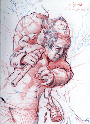
Then I put it on a straight forward gradient to sort of set the tone. and put the blend mode of the sketch layer on multiply.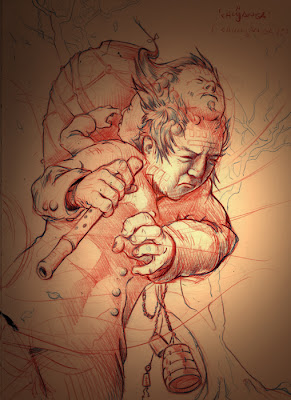
Then give the important bits a quick flat color. I also tried coloring thhe jacket and the flute and all the rest of it, but that made it all flat and boring.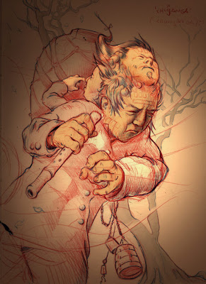
Next I threw in some high-lights. Almost done.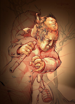
I did some experimenting with rendering the jacket and the tree and the urn on the guy's back but that took all the attention away from the faces so i just kept it simple. I did make the overall tone of the thing somewhat cooler because all that brown was getting a tad too poo-colored.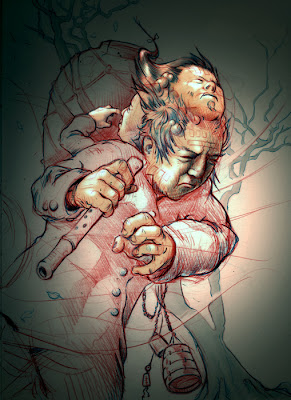
So that was that. Another lesson in "keep it simple, you idiot".
But to really put the pixel-based bastard to good use I need some practice first. Here's some of it.
I decided to color in one of the sketches I did in Korea, but without inking it, so I could use the pencil-shading I did on it.
First the original:

Then I put it on a straight forward gradient to sort of set the tone. and put the blend mode of the sketch layer on multiply.

Then give the important bits a quick flat color. I also tried coloring thhe jacket and the flute and all the rest of it, but that made it all flat and boring.

Next I threw in some high-lights. Almost done.

I did some experimenting with rendering the jacket and the tree and the urn on the guy's back but that took all the attention away from the faces so i just kept it simple. I did make the overall tone of the thing somewhat cooler because all that brown was getting a tad too poo-colored.

So that was that. Another lesson in "keep it simple, you idiot".
Sunday, May 27, 2007
Aaaaaaand we're back!
Yes folks, we're back... well I am anyway.
Still a bit jetlagged but those weeks in South Korea were great. The country is a breathtakingly beautiful, weird, dirty, spiritual, futuristic, traditional, spicy, friendly, proud, lovely place to be. It's so full of cool things to look at that I just couldn't stop taking pictures. I had to stop in the end because me little Nikon Coolpix 460 started complaining that it couldn't read the memory card.
I managed to get in just over 1400 (most of them crap) and in the end the memory card was fine and all the pictures made it back home. I will post pictures as soon as I've had a chance to sift through them all.
For now, here are some of the sketches I did to keep myself busy on the various trains, planes and automobiles.
Enjoy, gamsahamnidaaaaa!


Thursday, April 26, 2007
South Korea...
Hey friends...
There won't be any posting on here for a few weeks because I'll be in South Korea for a month.
But check back in June because I'll most likely have tons of pics, sketches and inspiration to post on when I'm back.
Hint: you can also use that nifty rss feed, then you don't have to remeber anything... ah isn't life easy sometimes...
Bye.
Wednesday, April 11, 2007
Those pesky clowns again...
In the nick of time I got them all done for ethe Garage Sale show. Which was this weekend.
I'm sorry I didn't post them any sooner. I couldn't be bothered.
The show made for a nice weekend, didn't sell much (apart from a a bunch of posters and some t-shirts). There was a couple of people interested in the Clowns but seeing as that the paint had litterally just dried the day before I had decided not to sell them. I want to look at them for a bit before I flog them off.
Here are the finished products.


This is how they were displayed during the show. Showing the whole saga of Paco's last day on this planet, in the right order.
I think the 'One-shot experiment' was a succes and I will definitely have do some more of these painting in future. But next time I want to try a slightly less weathered surface, and maybe some more color. We'll see.
I'm sorry I didn't post them any sooner. I couldn't be bothered.
The show made for a nice weekend, didn't sell much (apart from a a bunch of posters and some t-shirts). There was a couple of people interested in the Clowns but seeing as that the paint had litterally just dried the day before I had decided not to sell them. I want to look at them for a bit before I flog them off.
Here are the finished products.


This is how they were displayed during the show. Showing the whole saga of Paco's last day on this planet, in the right order.

I think the 'One-shot experiment' was a succes and I will definitely have do some more of these painting in future. But next time I want to try a slightly less weathered surface, and maybe some more color. We'll see.
Subscribe to:
Posts (Atom)