Sunday, September 24, 2006

Blind Girl's Bluff

Well as promissed here's a posting on the development of the Blind Girl's Bluff illustration.
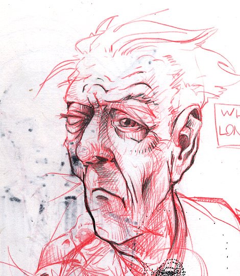
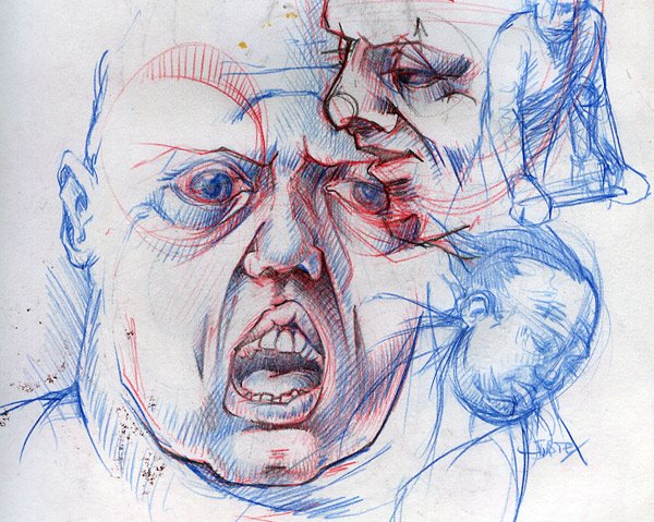
It's the third in a series of pieces that I've been working on for quite some time now. The first two I finished about 3 years ago, so this one has been a long time coming. For the first two check my previous posting.


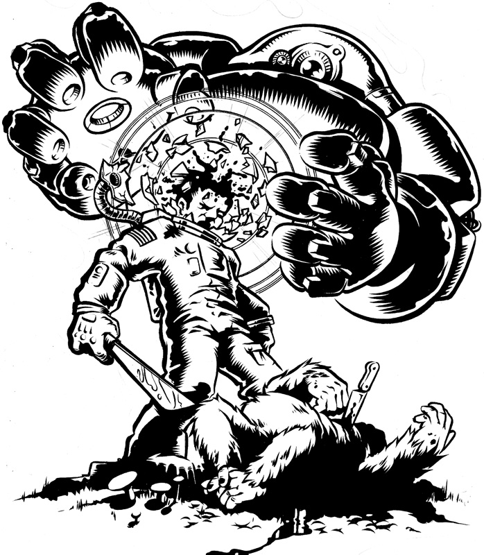
The level of detail on these is quite high so I had to ink the different parts seperately and re-assemble the thing in illustrator.


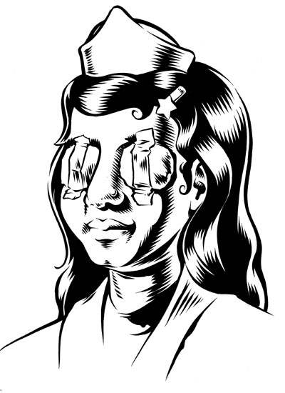
Since this is going to be blown up to a large size I'm going to have to convert this bit to vectors by hand. I sometimes use Adobe Streamline to convert the scans to vectors but this needs to be tight all the way up to the 110 x 145 cm of the final size.


This skull is only going to be little ornament at the top of the composition and only about a third the size of the portrait of the nurse. So that's why I couldn't fit all of it on one piece of paper. And even if I could, scanning that bastard would be a real pain in the ass on my little A4 Epson scanner.


The lettering is always a fun part to work on. Here I did a sort of faux-sanscrit roman to help hint at the cultural background of our leading lady.


Most of the different elements have been inked and scanned. I'm about half-way through vectorizing the scans, and then I can seriously start coloring it. I already did some tests but that jealded nothing satisfactory.
Anyweay I'll keep you posted on the progress.

Saturday, September 23, 2006

Todays Art

This weekend there was a big art festival going on in The Hague. All kinds of performances, films (projected on the sides of buildings) installations, visual arts, dance sculpture etc. are being displayed all around the city. Basically exactly what you would expect from an art festival.
I was asked by one of the organiser if I had some work I could show. And I had some lying around, but the finished result of my work is always a digital file. So granted it wasn't exactly lying around, bu tI had some. So we decided to have it printed on big-size printer. The prints came to 110 X 145cm. I would have liked them to be even bigger but that's as wide as te printer would go.

These illustrations aren't really all that recent. I did them a few years ago, but the public hadn't really been exposed to them so I thought it was ok to get them out.

There's a few more of these weird kids on the way. Right now I'm working on a blind nurse with a seeing-eye cat, and there plans for two more brewing.

I'll show some of the progress on that nurse on the next episode of the BOLTblog.
'Till then, in the words of the legendary Don Pardo: sweet dreams and happy tomorrows...

Wednesday, September 06, 2006

Digging for type....

Every type -nut (and you know who you are) is familiar with the dusty smell of old secondhand bookstores. Every type-nut (go on, it's ok to admit it) knows that special feeling of when they find that little book or card or poster that will soothe their craving just long enough to last untill the next visit to the bookstore/market/attic. Every type-nut (yes you are) will always be a type nut....So I was on my knees going through the bottom shelf of the typography section over at my local bookpusher, when I came across the book "Lettering Today" by John Brinkley.
Published in 1963 by Studio Vista, it shows a whole range of hand-drawn type and calligraphy by mainly European designers (among others Gerrit Noordzij, Max Caflisch, Chris Brand and Hermann Zapf). It was just what the doctor ordered to still my hunger...
Here are few hits.

Bookjacket by Hans Tisdall (original in several colors)


Bookjacket by Hannes Jähn (original in red and black)


Book jacket by Herbert Lindgren


Not sure but I'm guessing this one is by John Woodcock, another book jacket


Lettering for a book jacket bt Frau Inge Gack


Three elegant little bookplates by Will Carter, Will Carter and Francis Minns respectively.


It's awonderfull book get it if you can, it's full of wonderfull type and lettering. Apart from where is veers of into some hideous viny-plotted seventies signage... Anyway keep your browser locked to this station because I'll most likely post more of this stuff in the future.

Tuesday, September 05, 2006

Faces

For some reason I never doodle doodles anymore.
When I draw without thinking I draw heads and faces. Usually they all look alike which is very annoying, but sometimes some gems pop out. Here are some of the shinyer ones.


I use red and blue pencil for everything (not just drawing) mainly because it doesn't smudge or get your hand (as) dirty.


Are you starting to notice a pattern yet?


I think I should force myself to try some different angles.


Wasn't that riveting?
And imagine these were the more shiny gems... imagine the blandness of all the other crap I fill my sketchbooks with.
Next week... drying paint.

Sunday, September 03, 2006

Here goes....

Well this is the first posting. I'll try and get this as interesting as possible...
Lately I've been working on this illustration the image of which had been floating around in my brain for quite a while.
About a month ago I finally got it sketched out, on to paper and out of my head. Ever since then I've been trying to work on it in between commissioned work (which has taken up most of my time).

Here's the first rough sketch...


Based on this I did a slightly tighter blue-pencil.


But when I wanted to start on the robot I didn't really know what it shoud look like. So I went back and sketched out the robot first, added it and inked it.


On uncomissioned pieces I tend to go back and forth between inking and pencilling. I would pencil and add stuff after other parts were already inked. I'm still trying to decide if I'm gonna put a foreground and/or a background to this. I'm pretty sure it's going to have type although again I'm not sure what... I think a big "BRRRRRRRR" or "BZZZZZZ" over the head of the robot.

I'll keep you up to date on further developements...