As some of you might know, I did a short stint working at House Industries and that's where I met this guy Chris Gardner. He's an immensely tallented illustrator and actually the fella who turned me to using a brush and taking this illustration thing a lot more serious.
I recently found out he has a blog of his own. This guys work is as tight as a duck's arse.
Check it out.
Friday, June 15, 2007
Monday, June 11, 2007
Another PS coloring experiment...
I'm still trying to get more into Photoshop. I'm basically a big fat Illustrator fanatic (only using Photoshop to scan and adjust inks slightly), but I think in some cases it can be quite a bit more quick and efficient to use Photoshop.
But to really put the pixel-based bastard to good use I need some practice first. Here's some of it.
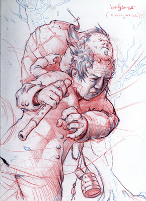
I decided to color in one of the sketches I did in Korea, but without inking it, so I could use the pencil-shading I did on it.
First the original:
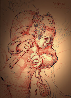
Then I put it on a straight forward gradient to sort of set the tone. and put the blend mode of the sketch layer on multiply.
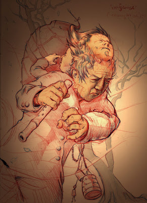
Then give the important bits a quick flat color. I also tried coloring thhe jacket and the flute and all the rest of it, but that made it all flat and boring.
Next I threw in some high-lights. Almost done.
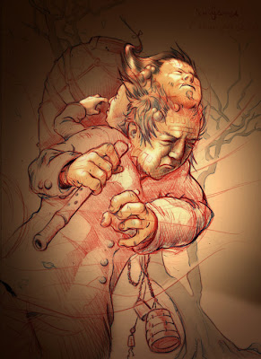
I did some experimenting with rendering the jacket and the tree and the urn on the guy's back but that took all the attention away from the faces so i just kept it simple. I did make the overall tone of the thing somewhat cooler because all that brown was getting a tad too poo-colored.
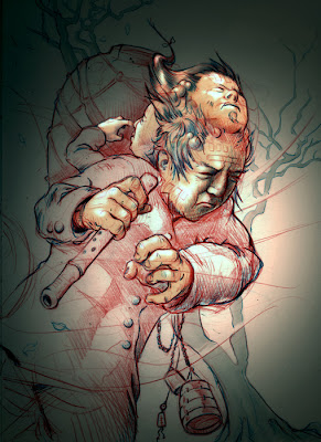
So that was that. Another lesson in "keep it simple, you idiot".
Subscribe to:
Posts (Atom)