The tightness of the edges and the endless scaling possibilities. I usually streamline my inks and color the whole shebang in Illustrator. But over recent months I've been admiring the works of people like James Jean and Asaf and Tomer Hanuka and I've been flirting with the idea of maybe *gulp*...switching.
I know, I know, I can just use both, but where's your sense of drama!?
Anyway I wanted to try coloring one of my illustrations in Photoshop, but I don't have much experience with it. I have, of course, been using photoshop for years, doing all kinds of odd jobs (scanning, retouching making images ready for prints etc.), but never actually for illustrating. I had made some failed attempts before but they were... well failed. This time I wanted to make real go of it.

A nice opportunity arose when one of my illustrations was deemed "too heavy" by the client after I had already inked it (some mix-up about the meaning of the words "sketch approved"). It was the style drawing I wanted to color because it was kind of realistic. For the more cartoony stuff I still like the flat tightness of illustrator.
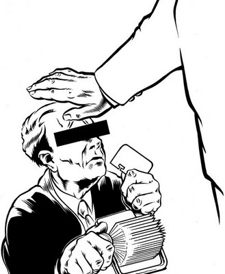
Quite a few artist who use photoshop don't even ink their art, but use really clean, partly shaded pencils. I might try that at some stage, but I really like inking and I don't want to loose too much of the clean tightness that comes with good ink.
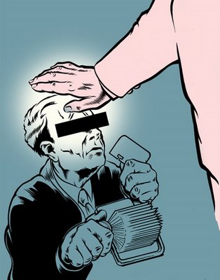
I didn't know where to start but I just went about it the way I would do a painting (with paint and brushes and stuff). So that meant the big shapes first. As with most of my experiments, I put in exactly 0.0 planning. So I made up the colors as went along... which is why they're not the most interesting of color schemes.
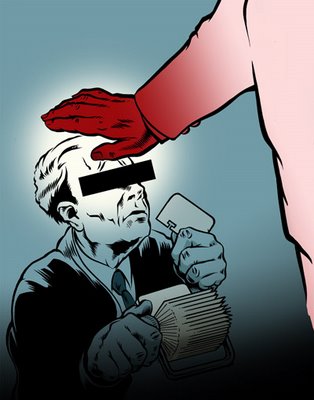
After the big gestures, start adding more and more of the smaller details.
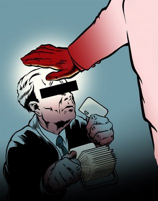
And that's where I decided to call it a day. I could add more detail, change some colors, redo some of the renderings, but as far as the experiment goes I think it's quite a successful one. I really want to get into this some more and also do a couple of 'professional' pieces. Although that's where I bump into one of big disadvantages of Photoshop... pixels. Which means none of that nifty infinite scaling that vectors offer. So that means thinking ahead a bit better and maybe buying a few more GB's or RAM.


