Hey friends...
There won't be any posting on here for a few weeks because I'll be in South Korea for a month.
But check back in June because I'll most likely have tons of pics, sketches and inspiration to post on when I'm back.
Hint: you can also use that nifty rss feed, then you don't have to remeber anything... ah isn't life easy sometimes...
Bye.

Thursday, April 26, 2007


Wednesday, April 11, 2007
Those pesky clowns again...
In the nick of time I got them all done for ethe Garage Sale show. Which was this weekend.
I'm sorry I didn't post them any sooner. I couldn't be bothered.
The show made for a nice weekend, didn't sell much (apart from a a bunch of posters and some t-shirts). There was a couple of people interested in the Clowns but seeing as that the paint had litterally just dried the day before I had decided not to sell them. I want to look at them for a bit before I flog them off.
Here are the finished products.


This is how they were displayed during the show. Showing the whole saga of Paco's last day on this planet, in the right order.
I think the 'One-shot experiment' was a succes and I will definitely have do some more of these painting in future. But next time I want to try a slightly less weathered surface, and maybe some more color. We'll see.
I'm sorry I didn't post them any sooner. I couldn't be bothered.
The show made for a nice weekend, didn't sell much (apart from a a bunch of posters and some t-shirts). There was a couple of people interested in the Clowns but seeing as that the paint had litterally just dried the day before I had decided not to sell them. I want to look at them for a bit before I flog them off.
Here are the finished products.


This is how they were displayed during the show. Showing the whole saga of Paco's last day on this planet, in the right order.

I think the 'One-shot experiment' was a succes and I will definitely have do some more of these painting in future. But next time I want to try a slightly less weathered surface, and maybe some more color. We'll see.
Monday, April 02, 2007
Send in the Clowns!!
Don't you just hate those face-painted psycho's emerging from tiny broken down fire-engines and squirting water all over everybody? With their grins and noses, walking down imaginary cellar steps, before utterly disappointing you by just standing up. It was all fake. He just crouched down. Somebody should have shot him in the neck when he was down there..... (or am i being harsh?)
So, back in my fantasy world of crayons I decided to set one on fire and after seeing his hair and career go down in flames, drink himself to death. Here's the play by play....
It all started with a doodle in my sketchbook.

And it pleased me enough to turn it into a series... Coincidentally I had 4 used skateboard decks lying around, and I thought it'd be nice idea to combine the two (get it? Clowns... skateboards).
Anyway I sketched on for the rest of the decks.


With the sketches done it was time to think about how I was going to stick them on the skateboard decks. I still had a tin of One Shot enamel and reckoned that stuff would be perfect... After some messing about, trying to transfer the images onto the wood I started to slap on the enamel paint.


As you can see I'm in the middle of painting the thing (and finishing up the drawing for the last deck) so I will continue blogging this particular subject at a later stage. But I hope I'll get them finished by the end of this week because I want to show them at the GarageSale art show, of which I will (hopefully) be a part....
Anyway keep 'em peeled.
So, back in my fantasy world of crayons I decided to set one on fire and after seeing his hair and career go down in flames, drink himself to death. Here's the play by play....
It all started with a doodle in my sketchbook.

And it pleased me enough to turn it into a series... Coincidentally I had 4 used skateboard decks lying around, and I thought it'd be nice idea to combine the two (get it? Clowns... skateboards).
Anyway I sketched on for the rest of the decks.


With the sketches done it was time to think about how I was going to stick them on the skateboard decks. I still had a tin of One Shot enamel and reckoned that stuff would be perfect... After some messing about, trying to transfer the images onto the wood I started to slap on the enamel paint.


As you can see I'm in the middle of painting the thing (and finishing up the drawing for the last deck) so I will continue blogging this particular subject at a later stage. But I hope I'll get them finished by the end of this week because I want to show them at the GarageSale art show, of which I will (hopefully) be a part....
Anyway keep 'em peeled.
Wednesday, March 21, 2007
Type added
A while back I posted something about a t-shirt design I was working on which had 3 caricatures on it....
See it here if you must.
Anyway I still needed to the lettering.... so I did.
I tried out a few different styles but soon enough arrived at a chunky script which was loose yet bold enough to correctly balance out the whole piece.

The on on the left (the lazy option) was too fascist looking. The other one to scrawny (and wobbly for that matter).
For the final version I did some sketches using a brush, which I have never done before. I've been practicing my brush-scripts, but I never actually used it.... well I haven't really used it this time but it helpful to kind of study the shapes and then base drawings on them. Just to make my lettershapes a bit more natural. One day I just have to retouch and scan in my brushed work, but seeing as I'm a clumsy lefty that day won't be tomorrow soon...
Anyway check out the sketches and the subsequent result.


For the "Noordwijk's own" and "TATTOO" I used the 'Poster' from the Housemovements collection (which came free with the House Industries Book). Did the trick beautifully. Don't you think?
See it here if you must.
Anyway I still needed to the lettering.... so I did.
I tried out a few different styles but soon enough arrived at a chunky script which was loose yet bold enough to correctly balance out the whole piece.

The on on the left (the lazy option) was too fascist looking. The other one to scrawny (and wobbly for that matter).
For the final version I did some sketches using a brush, which I have never done before. I've been practicing my brush-scripts, but I never actually used it.... well I haven't really used it this time but it helpful to kind of study the shapes and then base drawings on them. Just to make my lettershapes a bit more natural. One day I just have to retouch and scan in my brushed work, but seeing as I'm a clumsy lefty that day won't be tomorrow soon...
Anyway check out the sketches and the subsequent result.


For the "Noordwijk's own" and "TATTOO" I used the 'Poster' from the Housemovements collection (which came free with the House Industries Book). Did the trick beautifully. Don't you think?
Thursday, March 08, 2007
Easter Garage Sale!!!
On April 7,8 & 9 we'll be holding a garage sale!
It's the yearly reoccuring art-show by some of Amsterdam's finest low-brow artist. This year I've been asked to also take part. A great honour, but I really have to scramble to get some work together.
At the same time there's a show in a different part of the city in which I also take part (Ars Macabra Hollandica: see my previous post) so all of a sudden I needed new stuff to show. I can't bear showing old work so I'm working on all new pieces.
Well on one I've been already working for a while. The painting I've posted on earlier which I'll do more posts one later and hope to finish in time for the show.
One little side project which is going to be part of the Garage Sale Art Sho(p)w is a series of 4 23x23 cm Piëzo-(a.k.a. giclee-)prints by every participating artist. Those will be available for a great bargain: only 50 Euros!!
Anyway here's my entry:

I started this thing years ago. Well the drawing of the girl and the inks too. But I abandoned it after I did a really shabby 'experimental' coloring of it. So I decided to re-color it for this occasion, and put it to a background (which I did for this especially. sure kids, there's none of that 'graphic-ornaments-stock-book-with-CD-inside' bullshit going on here).
I did one thing I don;t usually do which is blur the background and add blurry shadows and stuff. I works... sort of.
Anyway, I hope you like it (you can come and buy one) and if you don't, let me know why... you miserable bastard.
It's the yearly reoccuring art-show by some of Amsterdam's finest low-brow artist. This year I've been asked to also take part. A great honour, but I really have to scramble to get some work together.
At the same time there's a show in a different part of the city in which I also take part (Ars Macabra Hollandica: see my previous post) so all of a sudden I needed new stuff to show. I can't bear showing old work so I'm working on all new pieces.
Well on one I've been already working for a while. The painting I've posted on earlier which I'll do more posts one later and hope to finish in time for the show.
One little side project which is going to be part of the Garage Sale Art Sho(p)w is a series of 4 23x23 cm Piëzo-(a.k.a. giclee-)prints by every participating artist. Those will be available for a great bargain: only 50 Euros!!
Anyway here's my entry:

I started this thing years ago. Well the drawing of the girl and the inks too. But I abandoned it after I did a really shabby 'experimental' coloring of it. So I decided to re-color it for this occasion, and put it to a background (which I did for this especially. sure kids, there's none of that 'graphic-ornaments-stock-book-with-CD-inside' bullshit going on here).
I did one thing I don;t usually do which is blur the background and add blurry shadows and stuff. I works... sort of.
Anyway, I hope you like it (you can come and buy one) and if you don't, let me know why... you miserable bastard.
Monday, March 05, 2007
ARS MACABRA HOLANDICA
In April this is one of the shows where some of my work will be on display...
Grand-opening: April first.
This is the flyer, which was done by Erik Kriek (also curator of the exhibition).
The front:

aaaaand the back:

Grand-opening: April first.
This is the flyer, which was done by Erik Kriek (also curator of the exhibition).
The front:

aaaaand the back:

Thursday, February 22, 2007
Caricatures inked
I put ink all over the caricatures that I drew a couple of weeks ago. I also put them together and drew some stuff around them (actually I did that before I put the ink on, you might be interested to know). Anyway here's the result.

I still need to put some type around it. I'll keep you posted on developments....

I still need to put some type around it. I'll keep you posted on developments....
Tuesday, February 20, 2007
New sights, new sounds...
Same beats though...
The operation was a success, ma'am. We successfully transplanted my office from The hague to Amsterdam. We took two days and today we jump-started all the equipment back into life and we're rolling again.
Here's a pics of my new digs, and as you can see I'm not done unpacking yet.

I share the studio with a bunch of other designers and programmers, in case you're wondering who; just check the newly added links to the right.
The operation was a success, ma'am. We successfully transplanted my office from The hague to Amsterdam. We took two days and today we jump-started all the equipment back into life and we're rolling again.
Here's a pics of my new digs, and as you can see I'm not done unpacking yet.
I share the studio with a bunch of other designers and programmers, in case you're wondering who; just check the newly added links to the right.
Tuesday, February 13, 2007
Even more of MY ADIDAS
The advertising agency (180 Amsterdam) send me some more pics of different so called mega-site that were put up for the ADIDAS campaign. As you might have read in earlier posts, I did the custom lettering for them.
These are all in Brazil, I guess they like it big over there.


I apologise for the quality of some of the shots...
These are all in Brazil, I guess they like it big over there.


I apologise for the quality of some of the shots...
Monday, February 05, 2007
Horror show returns
I finished the third part of the horror trilogy. It's another creepy one.
Not quite sure how I'm going to have them reproduced. Maybe have them screen-printed, although that's quite expensive. I'm also considering using a duplicator because that gives it a nice cheap and grubby look (screen-printing it might make them look too clean and crisp). Maybe present the inks as one-offs but then I won't have the color.... Anyway they have to be done and dusted by March 27.

Not quite sure how I'm going to have them reproduced. Maybe have them screen-printed, although that's quite expensive. I'm also considering using a duplicator because that gives it a nice cheap and grubby look (screen-printing it might make them look too clean and crisp). Maybe present the inks as one-offs but then I won't have the color.... Anyway they have to be done and dusted by March 27.

Friday, January 19, 2007
My First Caricatures
Marco Bratt is the man who I turn to when I need ink etched under my skin in elaborate Japanese designs. In the way I am the man he turns to when he needs any illustration and or dsign work done. Usually things like t-shirts, flyers and stickers; promotional stuff. The same with the latest assignment a t-shirt with a caricatue of him and his two buddies, Travis and Paul (who he shares his shop with) on the front of it.
The thing is I have never really done any caricatures before. Not on purpose anyway (I did a drawing once of a guy who, in the right light, looked like the late great Pope John Paul II). But I never back down from a challenge so I said "Sure! No problem at all!" And hit the pencils and pads as soon as I got home.
Then nothing really came out for about a month or two, plus I had to do it in between other projects because I had said I was going to do it for free. Every once in a while I would get back to it, but nothing would come out really.
Untill about a week or so ago. I was checking out a few blogs, one I check regularly Chris Wahl's and also Wouter Tulp's and Greg McCullough's blogs in parcticular. These guys are just plain geniusseses at it. So I was looking at their work and I was looking at the photographs I had of my subjects and it just sort of seemded to click. Then the drawings just fell out of my pencil.
The thing I found hard to decide on was which bit of the face to exagorate and which parts to keep (kind of) realistic. Especially for Marco's face, since he doesn't really have any one very 'obivous' feature, like a nose or eyes or whatever.
First I made his mouth and jaw bigger then the rest, but that wasn't it. Then I tried the same thing with his forehead. Still no success. But then the coin dropped, it had to be both... his obvious thing was that he just has a big head.

With Travis aand Paul the fact that I had their faces on 3/4 view helped a lot. Then it's just easier to have feature stick out of shrinck in more. I gave Travis' eyes a bit more of a relaxed look because in the final composition (they are all going to be combined into one piece) he'll be holding a spliff (something he only likes to do in his spare time I hasten to add). Paul will be holgin a dirty spattering tattoo machine (because doesn't use a foot switch but has his machine on constant current he makes a bit of a mess of his work station, his clothes and himself... but not his art though! Marco by the way willl be giving us the finger, something that best suits his personality....
 Travis
 ...and Paul
This really made me respect the guys who can just do this at first glance. I really have to study the face and then think and sketch and decide and then slowly I come to something that comes to a recognisable (because there-in lies the trick) caricature.
As I said these are the first ones I've ever done so I don't know how the seasoned caricature pros do it, but although it took me some time, I'm quite happy with the results.
If any of you pros out there read this I would very much appredicate comment and or critiques.
I'll show the inkings and the development of the rest of the thing (as I wrote above: they'll all be combined into one piece) in future postings. Keep 'em peeled.
The thing is I have never really done any caricatures before. Not on purpose anyway (I did a drawing once of a guy who, in the right light, looked like the late great Pope John Paul II). But I never back down from a challenge so I said "Sure! No problem at all!" And hit the pencils and pads as soon as I got home.
Then nothing really came out for about a month or two, plus I had to do it in between other projects because I had said I was going to do it for free. Every once in a while I would get back to it, but nothing would come out really.
Untill about a week or so ago. I was checking out a few blogs, one I check regularly Chris Wahl's and also Wouter Tulp's and Greg McCullough's blogs in parcticular. These guys are just plain geniusseses at it. So I was looking at their work and I was looking at the photographs I had of my subjects and it just sort of seemded to click. Then the drawings just fell out of my pencil.
The thing I found hard to decide on was which bit of the face to exagorate and which parts to keep (kind of) realistic. Especially for Marco's face, since he doesn't really have any one very 'obivous' feature, like a nose or eyes or whatever.
First I made his mouth and jaw bigger then the rest, but that wasn't it. Then I tried the same thing with his forehead. Still no success. But then the coin dropped, it had to be both... his obvious thing was that he just has a big head.

With Travis aand Paul the fact that I had their faces on 3/4 view helped a lot. Then it's just easier to have feature stick out of shrinck in more. I gave Travis' eyes a bit more of a relaxed look because in the final composition (they are all going to be combined into one piece) he'll be holding a spliff (something he only likes to do in his spare time I hasten to add). Paul will be holgin a dirty spattering tattoo machine (because doesn't use a foot switch but has his machine on constant current he makes a bit of a mess of his work station, his clothes and himself... but not his art though! Marco by the way willl be giving us the finger, something that best suits his personality....
 Travis
 ...and Paul
This really made me respect the guys who can just do this at first glance. I really have to study the face and then think and sketch and decide and then slowly I come to something that comes to a recognisable (because there-in lies the trick) caricature.
As I said these are the first ones I've ever done so I don't know how the seasoned caricature pros do it, but although it took me some time, I'm quite happy with the results.
If any of you pros out there read this I would very much appredicate comment and or critiques.
I'll show the inkings and the development of the rest of the thing (as I wrote above: they'll all be combined into one piece) in future postings. Keep 'em peeled.
Thursday, January 18, 2007
Movin' and shakin'... well movin' anyway
Times they are a-changing. And if not the times then certainly the addresses.
Me and the missus have decided to move to Amsterdam. Sick of commuting (my girlfriend works in Amsterdam) and always up for a new challenge we decided to move to the capital.
The big move will be in February and since I work from home, my business is moving too. Although I won't be working from home after the move. Anyway I thought I might as well tell my clients about it, so I decided to have a nice card printed to send 'round.
Coming up with an original 'concept' prooved to be quite tricky. I mean what about 'moving' hasn't been said about a million times before. And when it started to take a bit too much time I just went with looks instead of brains.
The look I wanted was sort of grubby or 'industrial' or D.I.Y.-ish even. So the color-scheme was easily decided. Red and yellow. Nice and loud. I also wanted the inking of the illustration on the front to be a bit more 'free' or more sketchy then what I ususally do. I've been trying to loosen up my brush inks and I thought this a good opportunity to practice.

In addition to the loose inking I decided to also have coloring a bit more 'freehand' the what I usually do (color it in Illustrator using paths). So I drew and inked the shading on paper firstthen scanned it and left is as it was, so no tidying up.

For the background of the truck I did a pattern made up of bolts (get it?) combined a big splotch of shading (which I did with a bit charcoal on paper, you might be surprised to know...not really).

Throw all these fine ingredients into a biig pot bring to the boil, stir and let simmer for about a day... then strain, sift and declare it finished (otherwise it just takes up to much time).

Now then that's one side of the card. Next: the other side.
As type is the other big part of the work I produce I thought I'd do a bit of custom type for the back. Not too much though, because the thinking and pondering and philophisising about the theme for the card had already taken way too much time. Anyway here are the sketches of type I did for the back.

The arrow I did in the sketch was too flowy and weak looking, so I straightened it out, because it would also suite the overall look and feel (the industrial and DIY thing) of the card. Which is also the reason I made the type and arrow look a bit weathered.

Et Voilá. I can now safely move offices without being afraid everybody will forget about me... I hope.
Me and the missus have decided to move to Amsterdam. Sick of commuting (my girlfriend works in Amsterdam) and always up for a new challenge we decided to move to the capital.
The big move will be in February and since I work from home, my business is moving too. Although I won't be working from home after the move. Anyway I thought I might as well tell my clients about it, so I decided to have a nice card printed to send 'round.
Coming up with an original 'concept' prooved to be quite tricky. I mean what about 'moving' hasn't been said about a million times before. And when it started to take a bit too much time I just went with looks instead of brains.
The look I wanted was sort of grubby or 'industrial' or D.I.Y.-ish even. So the color-scheme was easily decided. Red and yellow. Nice and loud. I also wanted the inking of the illustration on the front to be a bit more 'free' or more sketchy then what I ususally do. I've been trying to loosen up my brush inks and I thought this a good opportunity to practice.
In addition to the loose inking I decided to also have coloring a bit more 'freehand' the what I usually do (color it in Illustrator using paths). So I drew and inked the shading on paper firstthen scanned it and left is as it was, so no tidying up.
For the background of the truck I did a pattern made up of bolts (get it?) combined a big splotch of shading (which I did with a bit charcoal on paper, you might be surprised to know...not really).
Throw all these fine ingredients into a biig pot bring to the boil, stir and let simmer for about a day... then strain, sift and declare it finished (otherwise it just takes up to much time).

Now then that's one side of the card. Next: the other side.
As type is the other big part of the work I produce I thought I'd do a bit of custom type for the back. Not too much though, because the thinking and pondering and philophisising about the theme for the card had already taken way too much time. Anyway here are the sketches of type I did for the back.

The arrow I did in the sketch was too flowy and weak looking, so I straightened it out, because it would also suite the overall look and feel (the industrial and DIY thing) of the card. Which is also the reason I made the type and arrow look a bit weathered.

Et Voilá. I can now safely move offices without being afraid everybody will forget about me... I hope.
Thursday, January 11, 2007
Horror show
Not too long ago, I was asked by Erik Kriek if I wanted to show some work at an exhibition he was (or rather is) curating. I happily obliged because this woul be good reason to finish the painting I have been working of too long now, and get some ideas for drawings out aswell...
Speaking of which...
These are two of the illustration I'm going to exhibit. They are part of a series of either three or five, not sure about that yet.

I want to have them screen printed on some nice paper and ona decent size too... both of which are to be decided later.
For the exact dates of the exhibition kep you greedy eye-balls peeled to this station.
Speaking of which...
These are two of the illustration I'm going to exhibit. They are part of a series of either three or five, not sure about that yet.

I want to have them screen printed on some nice paper and ona decent size too... both of which are to be decided later.
For the exact dates of the exhibition kep you greedy eye-balls peeled to this station.
Some more of my ADIDAS
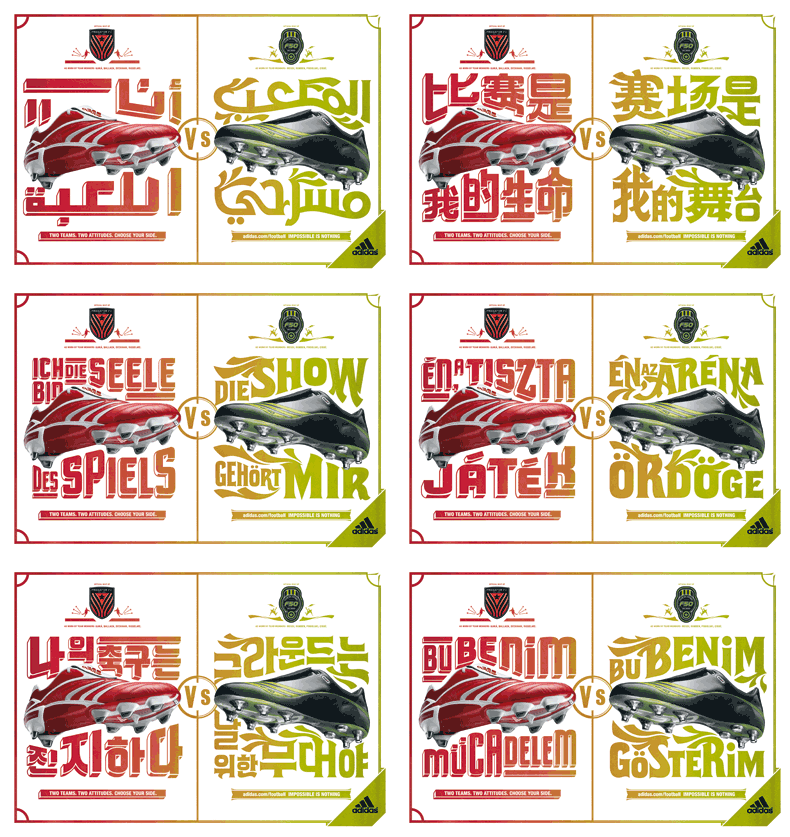
These are some of final color Adidas print-ads in the differen languages.
To save space I constructed this nifty gif animation (plus this prevents you from getting too close a look and noticing all kinds of ugly details).
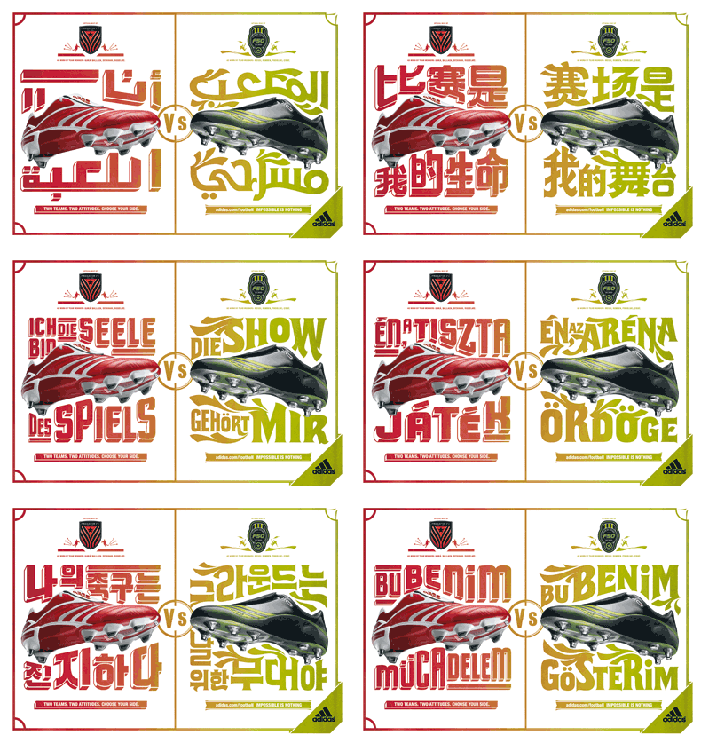
To save space I constructed this nifty gif animation (plus this prevents you from getting too close a look and noticing all kinds of ugly details).
Wednesday, December 27, 2006
The colors...
I've always been an Illustrator man.
The tightness of the edges and the endless scaling possibilities. I usually streamline my inks and color the whole shebang in Illustrator. But over recent months I've been admiring the works of people like James Jean and Asaf and Tomer Hanuka and I've been flirting with the idea of maybe *gulp*...switching.
I know, I know, I can just use both, but where's your sense of drama!?
Anyway I wanted to try coloring one of my illustrations in Photoshop, but I don't have much experience with it. I have, of course, been using photoshop for years, doing all kinds of odd jobs (scanning, retouching making images ready for prints etc.), but never actually for illustrating. I had made some failed attempts before but they were... well failed. This time I wanted to make real go of it.
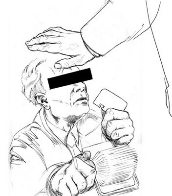
A nice opportunity arose when one of my illustrations was deemed "too heavy" by the client after I had already inked it (some mix-up about the meaning of the words "sketch approved"). It was the style drawing I wanted to color because it was kind of realistic. For the more cartoony stuff I still like the flat tightness of illustrator.
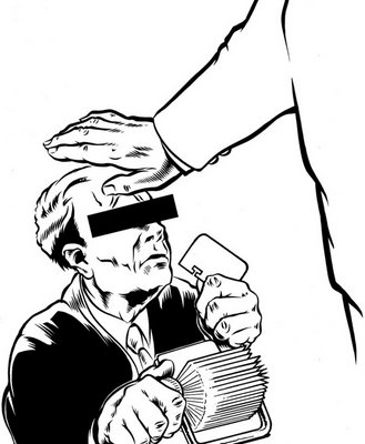
Quite a few artist who use photoshop don't even ink their art, but use really clean, partly shaded pencils. I might try that at some stage, but I really like inking and I don't want to loose too much of the clean tightness that comes with good ink.
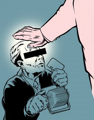
I didn't know where to start but I just went about it the way I would do a painting (with paint and brushes and stuff). So that meant the big shapes first. As with most of my experiments, I put in exactly 0.0 planning. So I made up the colors as went along... which is why they're not the most interesting of color schemes.
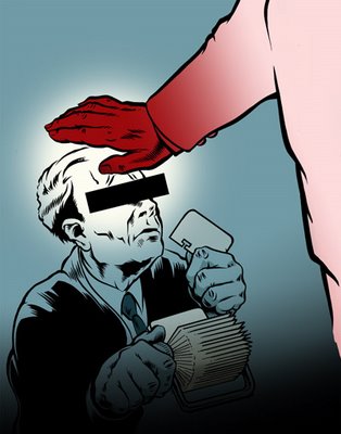
After the big gestures, start adding more and more of the smaller details.
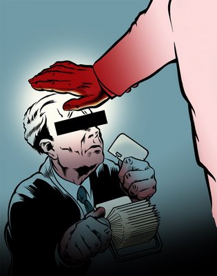
And that's where I decided to call it a day. I could add more detail, change some colors, redo some of the renderings, but as far as the experiment goes I think it's quite a successful one. I really want to get into this some more and also do a couple of 'professional' pieces. Although that's where I bump into one of big disadvantages of Photoshop... pixels. Which means none of that nifty infinite scaling that vectors offer. So that means thinking ahead a bit better and maybe buying a few more GB's or RAM.
The tightness of the edges and the endless scaling possibilities. I usually streamline my inks and color the whole shebang in Illustrator. But over recent months I've been admiring the works of people like James Jean and Asaf and Tomer Hanuka and I've been flirting with the idea of maybe *gulp*...switching.
I know, I know, I can just use both, but where's your sense of drama!?
Anyway I wanted to try coloring one of my illustrations in Photoshop, but I don't have much experience with it. I have, of course, been using photoshop for years, doing all kinds of odd jobs (scanning, retouching making images ready for prints etc.), but never actually for illustrating. I had made some failed attempts before but they were... well failed. This time I wanted to make real go of it.
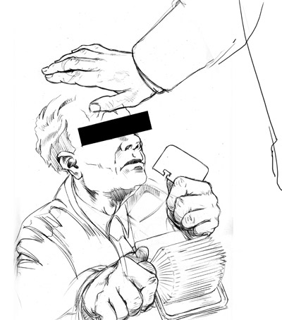
A nice opportunity arose when one of my illustrations was deemed "too heavy" by the client after I had already inked it (some mix-up about the meaning of the words "sketch approved"). It was the style drawing I wanted to color because it was kind of realistic. For the more cartoony stuff I still like the flat tightness of illustrator.
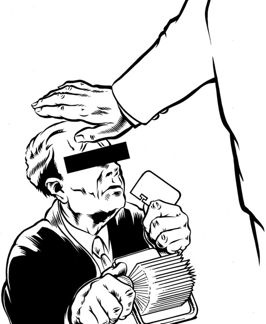
Quite a few artist who use photoshop don't even ink their art, but use really clean, partly shaded pencils. I might try that at some stage, but I really like inking and I don't want to loose too much of the clean tightness that comes with good ink.
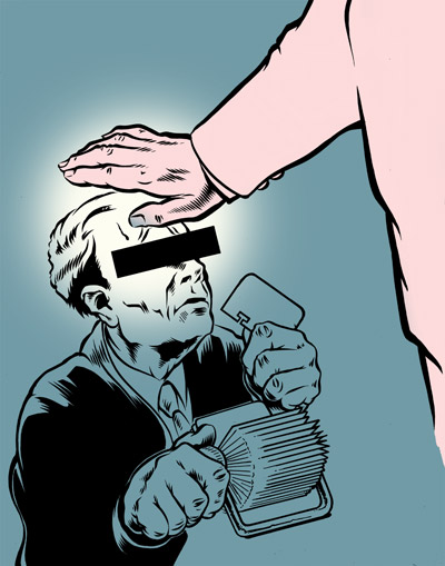
I didn't know where to start but I just went about it the way I would do a painting (with paint and brushes and stuff). So that meant the big shapes first. As with most of my experiments, I put in exactly 0.0 planning. So I made up the colors as went along... which is why they're not the most interesting of color schemes.
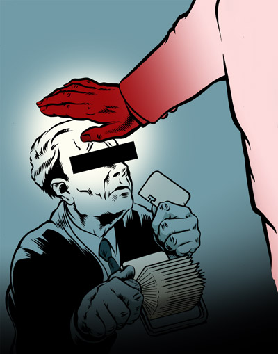
After the big gestures, start adding more and more of the smaller details.
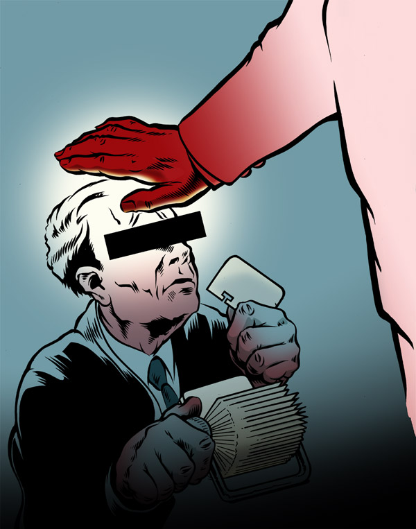
And that's where I decided to call it a day. I could add more detail, change some colors, redo some of the renderings, but as far as the experiment goes I think it's quite a successful one. I really want to get into this some more and also do a couple of 'professional' pieces. Although that's where I bump into one of big disadvantages of Photoshop... pixels. Which means none of that nifty infinite scaling that vectors offer. So that means thinking ahead a bit better and maybe buying a few more GB's or RAM.
Saturday, December 23, 2006
MY ADIDAS!
Father, it's been 2 months since my last confession... I do apologies.
In June of this past year I was approached by the 180 advertising agency in Amsterdam to help them out with the some custom typography for one of the campaigns the were working on. I went into their offices to be briefed (and sign a bunch of NDA's) and what I thought was about a 2 months worth of work turned into and almost al consuming project of a good 6 months.
They wanted me to do some custom lettering for the Adidas football boot campaign.
It meant having to design and draw two pieces of typography in (what became) 24 different languages... These included next to most western languages, Chinese, Japanese Arabic, Russian and Korean.
It was an offer I couldn't refuse so I went at it with all I had and the first applications are now being shown to the public....
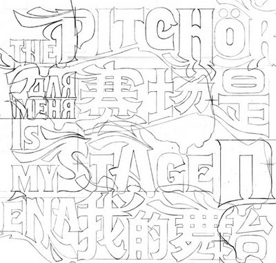
The campaign was developed to promote the latest edition of the Adidas soccerboots; the Predator and the F50.
The Predator is a the shoe for the methodical, tactical, technical player whereas the F50 was designed with the more flamboyant, fast and playful player in mind. The concept behind the campaign was based on the idea of these shoes representing two different teams, the punch-line being "Two team,two attitudes, choose your side". This had to be reflected in the type.
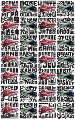 (Click the image for a closer look)
The type was based on two existing type-faces. One being the Flix and the other one the Cuba (a horribly cheap and crappy product and therefore needed a LOT of work before it was of any use). The reason for this was that they wanted to have other supporting typography in a similar style but were too cheap to let me design two faces from scratch... it wasn't that really, it would've just taken me too much time.
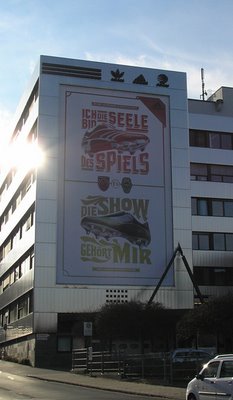
This is one of the first applications of the campaign. This one is in Germany and similar so-called 'mega-sites' will also be done in Brazil and Honk Kong. My typography is part of the print campaign. To check the commercials and other part of the whole thing check the Adidas website.
In June of this past year I was approached by the 180 advertising agency in Amsterdam to help them out with the some custom typography for one of the campaigns the were working on. I went into their offices to be briefed (and sign a bunch of NDA's) and what I thought was about a 2 months worth of work turned into and almost al consuming project of a good 6 months.
They wanted me to do some custom lettering for the Adidas football boot campaign.
It meant having to design and draw two pieces of typography in (what became) 24 different languages... These included next to most western languages, Chinese, Japanese Arabic, Russian and Korean.
It was an offer I couldn't refuse so I went at it with all I had and the first applications are now being shown to the public....
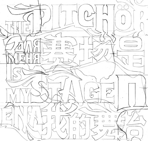
The campaign was developed to promote the latest edition of the Adidas soccerboots; the Predator and the F50.
The Predator is a the shoe for the methodical, tactical, technical player whereas the F50 was designed with the more flamboyant, fast and playful player in mind. The concept behind the campaign was based on the idea of these shoes representing two different teams, the punch-line being "Two team,two attitudes, choose your side". This had to be reflected in the type.
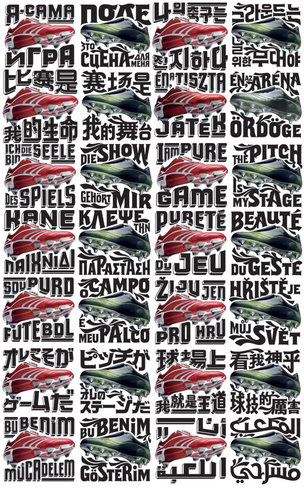 (Click the image for a closer look)
The type was based on two existing type-faces. One being the Flix and the other one the Cuba (a horribly cheap and crappy product and therefore needed a LOT of work before it was of any use). The reason for this was that they wanted to have other supporting typography in a similar style but were too cheap to let me design two faces from scratch... it wasn't that really, it would've just taken me too much time.

This is one of the first applications of the campaign. This one is in Germany and similar so-called 'mega-sites' will also be done in Brazil and Honk Kong. My typography is part of the print campaign. To check the commercials and other part of the whole thing check the Adidas website.
Sunday, October 29, 2006
Sneaker Tweaker
Well I have arrived... I finally did just about the hippest thing (or so I'm told) one can do as an artist nowadays.
I cuZtomized a shoe... a sneaker to be exact.
I was asked, together with my friends from StayGold and a guy called Jill, by the organizers of a little art/culture festival called 'Stoelendans' to come and sit in the middle of a dance-floor and doodle on shoes.
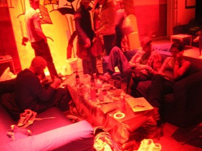
It was great fun. The venue was a club that during the day is bar/restaurant and then turns into a throbbing dance/booze/sex extravaganza at night. We were there during the day... rats! As I said we were in the middle of what at night is the dance-floor on couches which was nice enough... apart from the lighting.
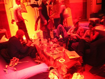
So it was really hard to judge the colors... I decides to stick to black, white and red straight from the can.
This was the first time I did this so it was a little bit scary to take a sharpy to some-one else's brand-new virgin white sneaker at first, but my old vandalizing tendencies from my graffiti days came flooding back to me soon enough.
I did take my time though. Jill, a newly befriended veteran shoe-customizer (the guy next to the empty spot on the couch) only did one half of the pair... so he got to do a lot more shoes. He wasn't to concerned with details neither. Big, bold shapes, two colors, real block-buster style. Great work! And a good lesson for me, if I ever get to do it again: don't sweat the small stuff.
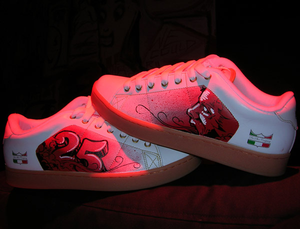
The first pair took me most of about 2,5 hours... masking, spray-paint, thinking, doubting, hesitating, some drawing, do a few high-lites and then multiply that be 2 and here's the result.
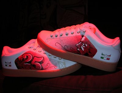
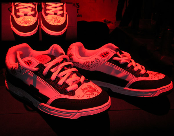
The second pair went a bit faster. I did them for a girl who wanted something not too 'big' or 'heavy'.
I did simple little ornaments in silver and black, with a flower and a bee on the noses of the shoe (sorry for the blurry inset, something must have gone wrong with the flash I guess)
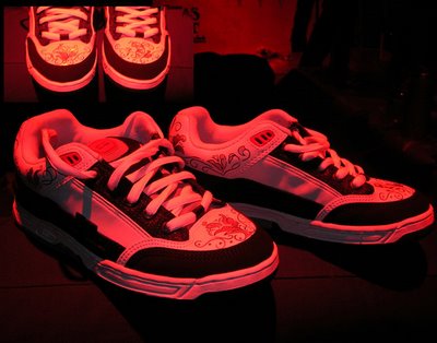
Anyway it was a lot of fun. A friend of mine to do his classic Adidas shell-toe high-tops, that he never wears (so "I might as well hang them on the wall"). When I finish them I'll post some pics on here too...
I cuZtomized a shoe... a sneaker to be exact.
I was asked, together with my friends from StayGold and a guy called Jill, by the organizers of a little art/culture festival called 'Stoelendans' to come and sit in the middle of a dance-floor and doodle on shoes.
It was great fun. The venue was a club that during the day is bar/restaurant and then turns into a throbbing dance/booze/sex extravaganza at night. We were there during the day... rats! As I said we were in the middle of what at night is the dance-floor on couches which was nice enough... apart from the lighting.
So it was really hard to judge the colors... I decides to stick to black, white and red straight from the can.
This was the first time I did this so it was a little bit scary to take a sharpy to some-one else's brand-new virgin white sneaker at first, but my old vandalizing tendencies from my graffiti days came flooding back to me soon enough.
I did take my time though. Jill, a newly befriended veteran shoe-customizer (the guy next to the empty spot on the couch) only did one half of the pair... so he got to do a lot more shoes. He wasn't to concerned with details neither. Big, bold shapes, two colors, real block-buster style. Great work! And a good lesson for me, if I ever get to do it again: don't sweat the small stuff.
The first pair took me most of about 2,5 hours... masking, spray-paint, thinking, doubting, hesitating, some drawing, do a few high-lites and then multiply that be 2 and here's the result.
The second pair went a bit faster. I did them for a girl who wanted something not too 'big' or 'heavy'.
I did simple little ornaments in silver and black, with a flower and a bee on the noses of the shoe (sorry for the blurry inset, something must have gone wrong with the flash I guess)
Anyway it was a lot of fun. A friend of mine to do his classic Adidas shell-toe high-tops, that he never wears (so "I might as well hang them on the wall"). When I finish them I'll post some pics on here too...
Wednesday, October 25, 2006
Growing paints
First off, excuse me for the title of this post, but I wanted to share some pics of a painting I'm working and the thing has been in development for a while. Ahh, I remember as though it was a day ago... (imagine the wobbly flash-back effect here).
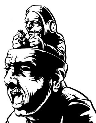
It all started with a sketch I did in one of my sketch books a couple of years ago, which looked like this:
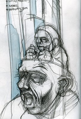
Nothing further was ever intended to happen with that sketch then to just sit there in the sketch book... But then I got an e-mail from Mark Beemer of Shirts for a Cure, a charity organization that offers financial aid to women with breast cancer and poor health insurance (check out the website), for whom I had been designing t-shirts for quite some time (I still do). He asked me if I was interested to do a design for the band The Draft and I happily obliged.
So I inked the thing and made design for the shirt.
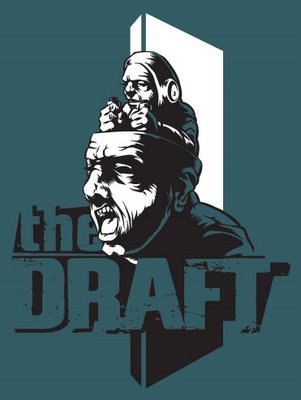
I did several designs the band decided to donate another design to Shirts for a Cure and use this one for themselves, for a small buy-out fee.
By then I had grown quite fond of the thing and the idea of doing it on a larger size sprouted somewhere in the back of my mind. I hadn't really worked on any decent sized painting since my college days and really needed to stock up on supplies and equipment. I got an easel from the basement of my girlfriend's granny's basement and I bought some new brushes and acrylics. I considered oils, but I'm working in my house now and I don't want to stink up the whole place. All I needed was a way to get the inked piece on blown up to the size of the canvas (100x100cms). I found an overhead projector on the Marktplaats (the Dutch local e-Bay), so I could finally start working on it.
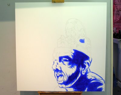
After I penciled the illustration on the canvas, I did a base color using ultramarine blue before I started painting. It will end up a different color but whatever that is going to be (probably black) this will make it a nice and deep dark color.
By this point I really didn't have clue of what I color I was going to paint the rest of the thing, so after I had finally finished the base color the painting was not much more the a annoyingly big thing in the middle of my room for about 4 months.
Then I decided to just fill in the background with a transparent red basecolor, to give whatever color that goes over it some depth. I don't have a picture of this. I took it, but misplaced.
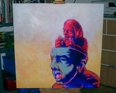
Anyway another 3 months and a move later there has been some development. I'm still not completely sold on the colors and the background. The little controller guy should become more fiery and the zombie has to be more greenish, more the color of oxidized copper. I'm pondering the possibility of a pattern in the background... but not sure yet.
It's nice to just let the thing grow as I go. It's a good to surprise myself which makes it fun.
It all started with a sketch I did in one of my sketch books a couple of years ago, which looked like this:
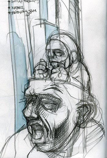
Nothing further was ever intended to happen with that sketch then to just sit there in the sketch book... But then I got an e-mail from Mark Beemer of Shirts for a Cure, a charity organization that offers financial aid to women with breast cancer and poor health insurance (check out the website), for whom I had been designing t-shirts for quite some time (I still do). He asked me if I was interested to do a design for the band The Draft and I happily obliged.
So I inked the thing and made design for the shirt.
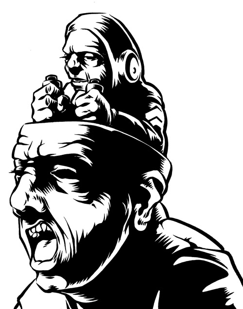
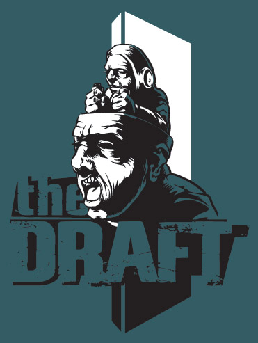
I did several designs the band decided to donate another design to Shirts for a Cure and use this one for themselves, for a small buy-out fee.
By then I had grown quite fond of the thing and the idea of doing it on a larger size sprouted somewhere in the back of my mind. I hadn't really worked on any decent sized painting since my college days and really needed to stock up on supplies and equipment. I got an easel from the basement of my girlfriend's granny's basement and I bought some new brushes and acrylics. I considered oils, but I'm working in my house now and I don't want to stink up the whole place. All I needed was a way to get the inked piece on blown up to the size of the canvas (100x100cms). I found an overhead projector on the Marktplaats (the Dutch local e-Bay), so I could finally start working on it.
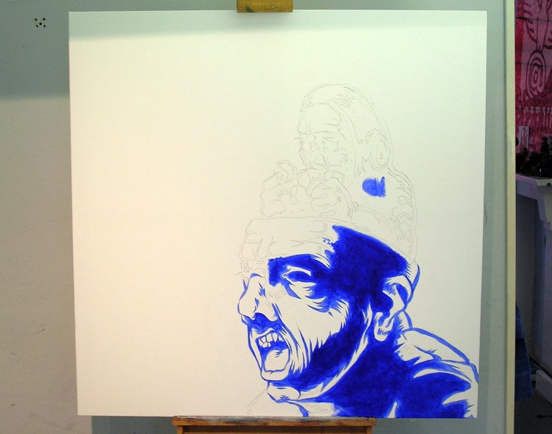
After I penciled the illustration on the canvas, I did a base color using ultramarine blue before I started painting. It will end up a different color but whatever that is going to be (probably black) this will make it a nice and deep dark color.
By this point I really didn't have clue of what I color I was going to paint the rest of the thing, so after I had finally finished the base color the painting was not much more the a annoyingly big thing in the middle of my room for about 4 months.
Then I decided to just fill in the background with a transparent red basecolor, to give whatever color that goes over it some depth. I don't have a picture of this. I took it, but misplaced.

Anyway another 3 months and a move later there has been some development. I'm still not completely sold on the colors and the background. The little controller guy should become more fiery and the zombie has to be more greenish, more the color of oxidized copper. I'm pondering the possibility of a pattern in the background... but not sure yet.
It's nice to just let the thing grow as I go. It's a good to surprise myself which makes it fun.
Friday, October 20, 2006
Flat bodies everywhere....
Well after a bit of radio silence ("It's madness at the office, honey, sorry I'm late") I think I should post some more sketches...
Since my last sketch post (in which I realized that I mostly draw faces) I consciously focused on drawing bodies more. And also try to put them into sort of interesting position. I found that it's something I REALLY have to work at and I'm going to do some live figure drawing classes. Because as every good artist knows there's nothing that will hone your skills sharper then drawing flabby naked 'eccentric' people from life. Anyway...
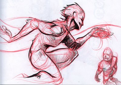 The far arm is too flat and not in the right place... nor is the far leg for that matter....
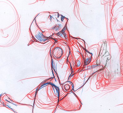 I also really need to actually do some drawings with more full bodies, instead of just sketches.
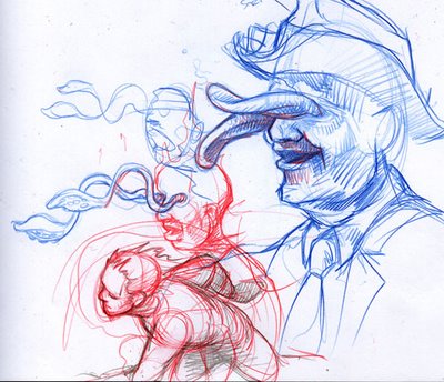 Ok this one is mainly a face but I liked it anyway...
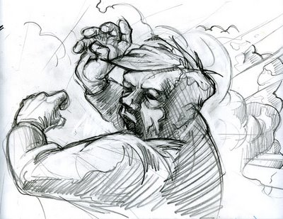 I wish I had paid more attention when I was still at arts college, but since I did graphic design, figure drawing and painting was only a small part of the curriculum. If only I could do it all over again...
As soon as the live figure-drawing classes start I'll post the results on here.
Since my last sketch post (in which I realized that I mostly draw faces) I consciously focused on drawing bodies more. And also try to put them into sort of interesting position. I found that it's something I REALLY have to work at and I'm going to do some live figure drawing classes. Because as every good artist knows there's nothing that will hone your skills sharper then drawing flabby naked 'eccentric' people from life. Anyway...
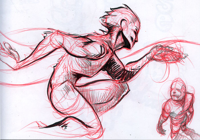 The far arm is too flat and not in the right place... nor is the far leg for that matter....
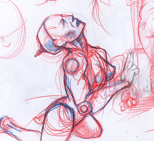 I also really need to actually do some drawings with more full bodies, instead of just sketches.
 Ok this one is mainly a face but I liked it anyway...
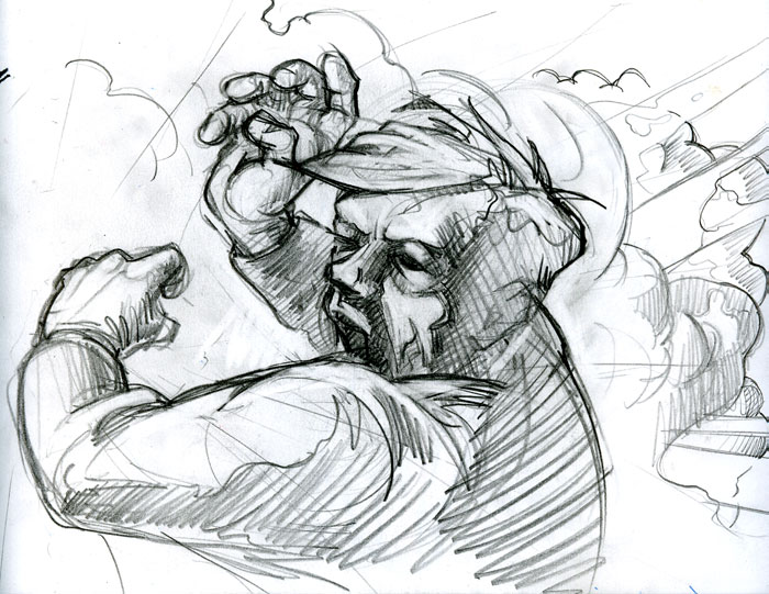 I wish I had paid more attention when I was still at arts college, but since I did graphic design, figure drawing and painting was only a small part of the curriculum. If only I could do it all over again...
As soon as the live figure-drawing classes start I'll post the results on here.
Subscribe to:
Posts (Atom)