

Showing posts with label type. Show all posts
Showing posts with label type. Show all posts
Friday, February 20, 2009
KUMOKUMO
I only just noticed that a good friend and college-colleague Bas Smidt has also been keeping a blog. Lot's of interesting graphic design stuff on there. Check it out: KUMOKUMO


Wednesday, September 26, 2007
Long time, no post...
Yeah sorry about that folks, it's been a while since my last post, but here it is. So stop your whining.
Since my move to Amsterdam I've been trying to free up time to work on a new visual identity for BOLTgraphics. I thought if I have to print new cards and letterhead I might as well freshen up the whole look of it.
Well I've finally mangaed to free up a few hours and here are some of the results...
The basic concept our new corporate identity will be one of flexibility. It will entail several different logo's within a consistent visual environment, to show versatility and flexibility. Or, to put it less pretentiously, I've been drawing a whole bunch of different logo's to show people I can do all kinds of styles...
So here are a few of them. These are not the colors I will be using for the visual identity, I want to keep that under wraps for now.


I'm gonna try and find out if I can get baseball jersey's with those last two. If so they'll be available in the BOLTgraphics online store.
Since my move to Amsterdam I've been trying to free up time to work on a new visual identity for BOLTgraphics. I thought if I have to print new cards and letterhead I might as well freshen up the whole look of it.
Well I've finally mangaed to free up a few hours and here are some of the results...
The basic concept our new corporate identity will be one of flexibility. It will entail several different logo's within a consistent visual environment, to show versatility and flexibility. Or, to put it less pretentiously, I've been drawing a whole bunch of different logo's to show people I can do all kinds of styles...
So here are a few of them. These are not the colors I will be using for the visual identity, I want to keep that under wraps for now.


I'm gonna try and find out if I can get baseball jersey's with those last two. If so they'll be available in the BOLTgraphics online store.
Tuesday, February 13, 2007
Even more of MY ADIDAS
The advertising agency (180 Amsterdam) send me some more pics of different so called mega-site that were put up for the ADIDAS campaign. As you might have read in earlier posts, I did the custom lettering for them.
These are all in Brazil, I guess they like it big over there.


I apologise for the quality of some of the shots...
These are all in Brazil, I guess they like it big over there.


I apologise for the quality of some of the shots...
Thursday, January 18, 2007
Movin' and shakin'... well movin' anyway
Times they are a-changing. And if not the times then certainly the addresses.
Me and the missus have decided to move to Amsterdam. Sick of commuting (my girlfriend works in Amsterdam) and always up for a new challenge we decided to move to the capital.
The big move will be in February and since I work from home, my business is moving too. Although I won't be working from home after the move. Anyway I thought I might as well tell my clients about it, so I decided to have a nice card printed to send 'round.
Coming up with an original 'concept' prooved to be quite tricky. I mean what about 'moving' hasn't been said about a million times before. And when it started to take a bit too much time I just went with looks instead of brains.
The look I wanted was sort of grubby or 'industrial' or D.I.Y.-ish even. So the color-scheme was easily decided. Red and yellow. Nice and loud. I also wanted the inking of the illustration on the front to be a bit more 'free' or more sketchy then what I ususally do. I've been trying to loosen up my brush inks and I thought this a good opportunity to practice.

In addition to the loose inking I decided to also have coloring a bit more 'freehand' the what I usually do (color it in Illustrator using paths). So I drew and inked the shading on paper firstthen scanned it and left is as it was, so no tidying up.

For the background of the truck I did a pattern made up of bolts (get it?) combined a big splotch of shading (which I did with a bit charcoal on paper, you might be surprised to know...not really).

Throw all these fine ingredients into a biig pot bring to the boil, stir and let simmer for about a day... then strain, sift and declare it finished (otherwise it just takes up to much time).

Now then that's one side of the card. Next: the other side.
As type is the other big part of the work I produce I thought I'd do a bit of custom type for the back. Not too much though, because the thinking and pondering and philophisising about the theme for the card had already taken way too much time. Anyway here are the sketches of type I did for the back.

The arrow I did in the sketch was too flowy and weak looking, so I straightened it out, because it would also suite the overall look and feel (the industrial and DIY thing) of the card. Which is also the reason I made the type and arrow look a bit weathered.

Et Voilá. I can now safely move offices without being afraid everybody will forget about me... I hope.
Me and the missus have decided to move to Amsterdam. Sick of commuting (my girlfriend works in Amsterdam) and always up for a new challenge we decided to move to the capital.
The big move will be in February and since I work from home, my business is moving too. Although I won't be working from home after the move. Anyway I thought I might as well tell my clients about it, so I decided to have a nice card printed to send 'round.
Coming up with an original 'concept' prooved to be quite tricky. I mean what about 'moving' hasn't been said about a million times before. And when it started to take a bit too much time I just went with looks instead of brains.
The look I wanted was sort of grubby or 'industrial' or D.I.Y.-ish even. So the color-scheme was easily decided. Red and yellow. Nice and loud. I also wanted the inking of the illustration on the front to be a bit more 'free' or more sketchy then what I ususally do. I've been trying to loosen up my brush inks and I thought this a good opportunity to practice.
In addition to the loose inking I decided to also have coloring a bit more 'freehand' the what I usually do (color it in Illustrator using paths). So I drew and inked the shading on paper firstthen scanned it and left is as it was, so no tidying up.
For the background of the truck I did a pattern made up of bolts (get it?) combined a big splotch of shading (which I did with a bit charcoal on paper, you might be surprised to know...not really).
Throw all these fine ingredients into a biig pot bring to the boil, stir and let simmer for about a day... then strain, sift and declare it finished (otherwise it just takes up to much time).

Now then that's one side of the card. Next: the other side.
As type is the other big part of the work I produce I thought I'd do a bit of custom type for the back. Not too much though, because the thinking and pondering and philophisising about the theme for the card had already taken way too much time. Anyway here are the sketches of type I did for the back.

The arrow I did in the sketch was too flowy and weak looking, so I straightened it out, because it would also suite the overall look and feel (the industrial and DIY thing) of the card. Which is also the reason I made the type and arrow look a bit weathered.

Et Voilá. I can now safely move offices without being afraid everybody will forget about me... I hope.
Thursday, January 11, 2007
Some more of my ADIDAS
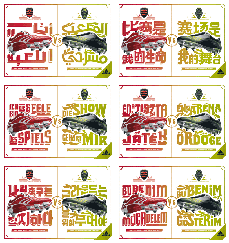
These are some of final color Adidas print-ads in the differen languages.
To save space I constructed this nifty gif animation (plus this prevents you from getting too close a look and noticing all kinds of ugly details).
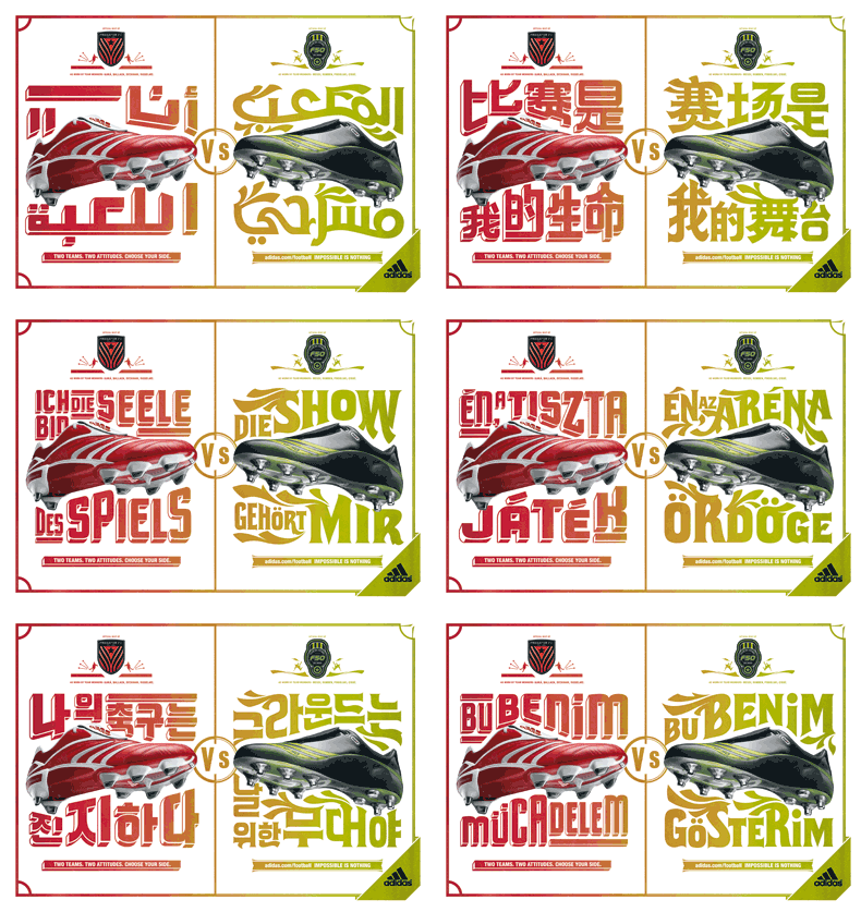
To save space I constructed this nifty gif animation (plus this prevents you from getting too close a look and noticing all kinds of ugly details).
Saturday, December 23, 2006
MY ADIDAS!
Father, it's been 2 months since my last confession... I do apologies.
In June of this past year I was approached by the 180 advertising agency in Amsterdam to help them out with the some custom typography for one of the campaigns the were working on. I went into their offices to be briefed (and sign a bunch of NDA's) and what I thought was about a 2 months worth of work turned into and almost al consuming project of a good 6 months.
They wanted me to do some custom lettering for the Adidas football boot campaign.
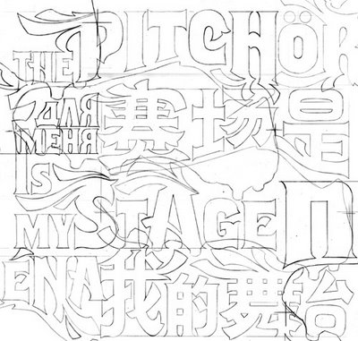
It meant having to design and draw two pieces of typography in (what became) 24 different languages... These included next to most western languages, Chinese, Japanese Arabic, Russian and Korean.
It was an offer I couldn't refuse so I went at it with all I had and the first applications are now being shown to the public....
The campaign was developed to promote the latest edition of the Adidas soccerboots; the Predator and the F50.
The Predator is a the shoe for the methodical, tactical, technical player whereas the F50 was designed with the more flamboyant, fast and playful player in mind. The concept behind the campaign was based on the idea of these shoes representing two different teams, the punch-line being "Two team,two attitudes, choose your side". This had to be reflected in the type.
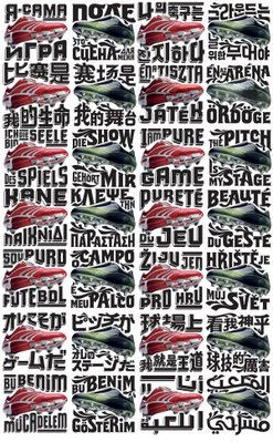 (Click the image for a closer look)
The type was based on two existing type-faces. One being the Flix and the other one the Cuba (a horribly cheap and crappy product and therefore needed a LOT of work before it was of any use). The reason for this was that they wanted to have other supporting typography in a similar style but were too cheap to let me design two faces from scratch... it wasn't that really, it would've just taken me too much time.
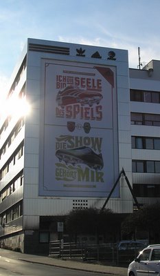
This is one of the first applications of the campaign. This one is in Germany and similar so-called 'mega-sites' will also be done in Brazil and Honk Kong. My typography is part of the print campaign. To check the commercials and other part of the whole thing check the Adidas website.
In June of this past year I was approached by the 180 advertising agency in Amsterdam to help them out with the some custom typography for one of the campaigns the were working on. I went into their offices to be briefed (and sign a bunch of NDA's) and what I thought was about a 2 months worth of work turned into and almost al consuming project of a good 6 months.
They wanted me to do some custom lettering for the Adidas football boot campaign.
It meant having to design and draw two pieces of typography in (what became) 24 different languages... These included next to most western languages, Chinese, Japanese Arabic, Russian and Korean.
It was an offer I couldn't refuse so I went at it with all I had and the first applications are now being shown to the public....
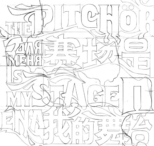
The campaign was developed to promote the latest edition of the Adidas soccerboots; the Predator and the F50.
The Predator is a the shoe for the methodical, tactical, technical player whereas the F50 was designed with the more flamboyant, fast and playful player in mind. The concept behind the campaign was based on the idea of these shoes representing two different teams, the punch-line being "Two team,two attitudes, choose your side". This had to be reflected in the type.
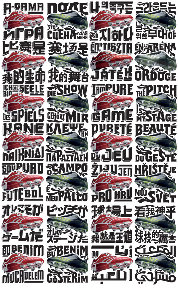 (Click the image for a closer look)
The type was based on two existing type-faces. One being the Flix and the other one the Cuba (a horribly cheap and crappy product and therefore needed a LOT of work before it was of any use). The reason for this was that they wanted to have other supporting typography in a similar style but were too cheap to let me design two faces from scratch... it wasn't that really, it would've just taken me too much time.

This is one of the first applications of the campaign. This one is in Germany and similar so-called 'mega-sites' will also be done in Brazil and Honk Kong. My typography is part of the print campaign. To check the commercials and other part of the whole thing check the Adidas website.
Subscribe to:
Posts (Atom)