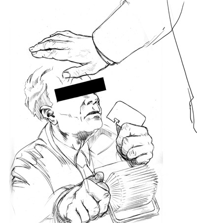
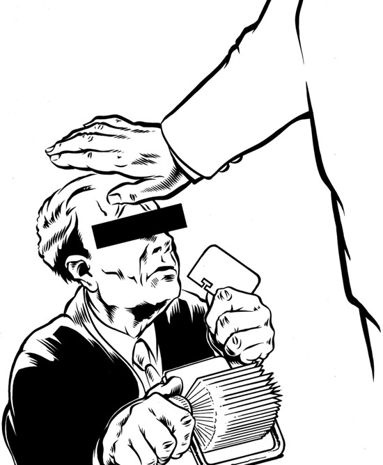
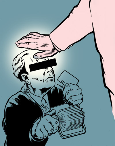
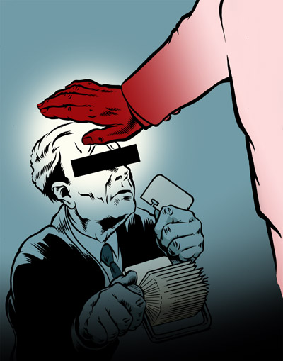
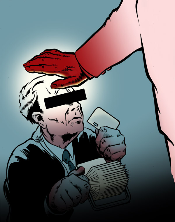
Over the last few years I've been asked more and more to do portrait. For a variety of clients, but mainly for a Dutch magazine call the REVU. About 6 weeks ago I finished the last out of a series of 4 portraits of this writer named Henk van Straten.
Every week Henk covers a story about people that ended up in court, all for different reasons. Some severe, others not so.
The brief: a portrait of Henk (showing off his tattoos, which suit his young and punchy style of writing) and 'something to do with the justice system'.
Showing posts with label illustration. Show all posts
Wednesday, August 22, 2012
Thursday, June 17, 2010
World Cup Fever!!
It's been out for a while but as the Football World Cup is in full swing at the minute, I thought I'd show you this now.
Barcelona based ad-agency Vasava was commissioned by 55DSL and Panini to come up with a line of shirts (as part of a bigger campaign) to celebrate the World Cup and Football in general.
They invited artists from around the world to represent their country in a t-shirt design. I of course came out for the Netherlands.
We were free to do whatever we wanted with the only restriction being the use of colors, they had to be the national colors of out countries.
The idea behind my piece was the one of the boy dreaming of becoming a football star and one day competing in the World Cup.
Here's the sketch:

Inked and colored:


Then client thought they would prefer to have their logos incorporated into the design after all. Which was fair enough of course. Also, it wasn't possible for the fabric to have a color, so that had to become white.
With these amendments this became the final design:

Go buy one at the 55dsl online shop.
Barcelona based ad-agency Vasava was commissioned by 55DSL and Panini to come up with a line of shirts (as part of a bigger campaign) to celebrate the World Cup and Football in general.
They invited artists from around the world to represent their country in a t-shirt design. I of course came out for the Netherlands.
We were free to do whatever we wanted with the only restriction being the use of colors, they had to be the national colors of out countries.
The idea behind my piece was the one of the boy dreaming of becoming a football star and one day competing in the World Cup.
Here's the sketch:

Inked and colored:


Then client thought they would prefer to have their logos incorporated into the design after all. Which was fair enough of course. Also, it wasn't possible for the fabric to have a color, so that had to become white.
With these amendments this became the final design:

Go buy one at the 55dsl online shop.
Labels:
55dsl,
Football World Cup 2010,
illustration,
Panini,
soccer
Friday, November 20, 2009
STATE-X NEW FORMS
Yeah yeah I know, it's been too long since I last posted something... but here it is now, so quit your yapping.
The beautiful city of The Hague is quickly turning into one of the more cultural cities in the Netherlands as well. One of the ways by which it is doing this is through a festival called State-X New Forms. It's a festival focussing on alternative electronic and underground music and art... Or as they put it themselves "Festival for avant-rock, cutting-edge electronics and nu-art".
They asked me to design and art-direct the whole publicity side of this year's event. As you might remember I showed the proposals for the style that they didn't go for earlier this year (click here or just scroll down... yeah again I'm sorry I haven't been posting jeeees!!).
Here's what they liked better:
Flyers (collect all 4!!):

Posters:

All kinds:

The whole thing goes down on the 11th and 12th of December. There's some more stuff I did for this project but I can't really show that since it's not been made public yet.
If you're interested in going, here's the website (the design for which I was not responsible).
Thanks for your patience...
The beautiful city of The Hague is quickly turning into one of the more cultural cities in the Netherlands as well. One of the ways by which it is doing this is through a festival called State-X New Forms. It's a festival focussing on alternative electronic and underground music and art... Or as they put it themselves "Festival for avant-rock, cutting-edge electronics and nu-art".
They asked me to design and art-direct the whole publicity side of this year's event. As you might remember I showed the proposals for the style that they didn't go for earlier this year (click here or just scroll down... yeah again I'm sorry I haven't been posting jeeees!!).
Here's what they liked better:
Flyers (collect all 4!!):

Posters:

All kinds:

The whole thing goes down on the 11th and 12th of December. There's some more stuff I did for this project but I can't really show that since it's not been made public yet.
If you're interested in going, here's the website (the design for which I was not responsible).
Thanks for your patience...
Labels:
graphic design,
illustration,
state-x new forms
Friday, February 27, 2009
Nightmare
These are a few illustrations I did for the magazine Zeilen [Sailing]. The article, titled 'de Nachtmerrie' [the Nightmare] was the true story about a young Dutch sailor traveling around the Caribbean islands where he got found himself blackmailed (over a bogus poker debt) by Colombian gangsters to transport a shipment of drugs to Europe.
It's a harrowing story and the poor guy is now locked up in a French jail, where he can't even defend himself in court for fear of retributions as even in prison the gangsters threatened to harm his loved-ones if he were to testify.
Anyway... the illustrations; the first one is the main one, the other three are fillers.


It's a harrowing story and the poor guy is now locked up in a French jail, where he can't even defend himself in court for fear of retributions as even in prison the gangsters threatened to harm his loved-ones if he were to testify.
Anyway... the illustrations; the first one is the main one, the other three are fillers.


Friday, April 04, 2008
Sketches are drawings too...
As some of you (but only some) might have noticed, an illustration I did was published in the Dutch magazine Nieuwe Revu last week. It was a portrait of strong arm to Dutch crime boss Willem Enstra and somewhat ironically named Geurt Roos (for all you non-Dutchies his names sort of translates into Smells [like] Rose). I was asked to do the portrait because they only had a really bad photograph of the guy and they liked a portrait I had done of musician Pop Levi.
So I did a sketch for them to approve... and they came back with not only approval of the sketch but they wanted to actually use the sketch instead of a 'final inked version (like the Levi piece) because it fit the new style of their mag better.
It was a nice surprise, were it not for the fact that I had (somewhat over confident) already inked the thing... oh well. I cleaned the sketch up a bit, but it went in the magazine almost unchanged... Maybe I spend too much time on my sketches?
Here's the stuff I did for the mag plus a quick scan (unpolished) of the inks.


So I did a sketch for them to approve... and they came back with not only approval of the sketch but they wanted to actually use the sketch instead of a 'final inked version (like the Levi piece) because it fit the new style of their mag better.
It was a nice surprise, were it not for the fact that I had (somewhat over confident) already inked the thing... oh well. I cleaned the sketch up a bit, but it went in the magazine almost unchanged... Maybe I spend too much time on my sketches?
Here's the stuff I did for the mag plus a quick scan (unpolished) of the inks.


Labels:
illustration,
Nieuwe Revu,
Pop Levi,
portrait,
sketches
Thursday, March 08, 2007
Easter Garage Sale!!!
On April 7,8 & 9 we'll be holding a garage sale!
It's the yearly reoccuring art-show by some of Amsterdam's finest low-brow artist. This year I've been asked to also take part. A great honour, but I really have to scramble to get some work together.
At the same time there's a show in a different part of the city in which I also take part (Ars Macabra Hollandica: see my previous post) so all of a sudden I needed new stuff to show. I can't bear showing old work so I'm working on all new pieces.
Well on one I've been already working for a while. The painting I've posted on earlier which I'll do more posts one later and hope to finish in time for the show.
One little side project which is going to be part of the Garage Sale Art Sho(p)w is a series of 4 23x23 cm Piëzo-(a.k.a. giclee-)prints by every participating artist. Those will be available for a great bargain: only 50 Euros!!
Anyway here's my entry:

I started this thing years ago. Well the drawing of the girl and the inks too. But I abandoned it after I did a really shabby 'experimental' coloring of it. So I decided to re-color it for this occasion, and put it to a background (which I did for this especially. sure kids, there's none of that 'graphic-ornaments-stock-book-with-CD-inside' bullshit going on here).
I did one thing I don;t usually do which is blur the background and add blurry shadows and stuff. I works... sort of.
Anyway, I hope you like it (you can come and buy one) and if you don't, let me know why... you miserable bastard.
It's the yearly reoccuring art-show by some of Amsterdam's finest low-brow artist. This year I've been asked to also take part. A great honour, but I really have to scramble to get some work together.
At the same time there's a show in a different part of the city in which I also take part (Ars Macabra Hollandica: see my previous post) so all of a sudden I needed new stuff to show. I can't bear showing old work so I'm working on all new pieces.
Well on one I've been already working for a while. The painting I've posted on earlier which I'll do more posts one later and hope to finish in time for the show.
One little side project which is going to be part of the Garage Sale Art Sho(p)w is a series of 4 23x23 cm Piëzo-(a.k.a. giclee-)prints by every participating artist. Those will be available for a great bargain: only 50 Euros!!
Anyway here's my entry:

I started this thing years ago. Well the drawing of the girl and the inks too. But I abandoned it after I did a really shabby 'experimental' coloring of it. So I decided to re-color it for this occasion, and put it to a background (which I did for this especially. sure kids, there's none of that 'graphic-ornaments-stock-book-with-CD-inside' bullshit going on here).
I did one thing I don;t usually do which is blur the background and add blurry shadows and stuff. I works... sort of.
Anyway, I hope you like it (you can come and buy one) and if you don't, let me know why... you miserable bastard.
Friday, January 19, 2007
My First Caricatures
Marco Bratt is the man who I turn to when I need ink etched under my skin in elaborate Japanese designs. In the way I am the man he turns to when he needs any illustration and or dsign work done. Usually things like t-shirts, flyers and stickers; promotional stuff. The same with the latest assignment a t-shirt with a caricatue of him and his two buddies, Travis and Paul (who he shares his shop with) on the front of it.
The thing is I have never really done any caricatures before. Not on purpose anyway (I did a drawing once of a guy who, in the right light, looked like the late great Pope John Paul II). But I never back down from a challenge so I said "Sure! No problem at all!" And hit the pencils and pads as soon as I got home.
Then nothing really came out for about a month or two, plus I had to do it in between other projects because I had said I was going to do it for free. Every once in a while I would get back to it, but nothing would come out really.
Untill about a week or so ago. I was checking out a few blogs, one I check regularly Chris Wahl's and also Wouter Tulp's and Greg McCullough's blogs in parcticular. These guys are just plain geniusseses at it. So I was looking at their work and I was looking at the photographs I had of my subjects and it just sort of seemded to click. Then the drawings just fell out of my pencil.
The thing I found hard to decide on was which bit of the face to exagorate and which parts to keep (kind of) realistic. Especially for Marco's face, since he doesn't really have any one very 'obivous' feature, like a nose or eyes or whatever.
First I made his mouth and jaw bigger then the rest, but that wasn't it. Then I tried the same thing with his forehead. Still no success. But then the coin dropped, it had to be both... his obvious thing was that he just has a big head.

With Travis aand Paul the fact that I had their faces on 3/4 view helped a lot. Then it's just easier to have feature stick out of shrinck in more. I gave Travis' eyes a bit more of a relaxed look because in the final composition (they are all going to be combined into one piece) he'll be holding a spliff (something he only likes to do in his spare time I hasten to add). Paul will be holgin a dirty spattering tattoo machine (because doesn't use a foot switch but has his machine on constant current he makes a bit of a mess of his work station, his clothes and himself... but not his art though! Marco by the way willl be giving us the finger, something that best suits his personality....
Travis
...and Paul
This really made me respect the guys who can just do this at first glance. I really have to study the face and then think and sketch and decide and then slowly I come to something that comes to a recognisable (because there-in lies the trick) caricature.
As I said these are the first ones I've ever done so I don't know how the seasoned caricature pros do it, but although it took me some time, I'm quite happy with the results.
If any of you pros out there read this I would very much appredicate comment and or critiques.
I'll show the inkings and the development of the rest of the thing (as I wrote above: they'll all be combined into one piece) in future postings. Keep 'em peeled.
The thing is I have never really done any caricatures before. Not on purpose anyway (I did a drawing once of a guy who, in the right light, looked like the late great Pope John Paul II). But I never back down from a challenge so I said "Sure! No problem at all!" And hit the pencils and pads as soon as I got home.
Then nothing really came out for about a month or two, plus I had to do it in between other projects because I had said I was going to do it for free. Every once in a while I would get back to it, but nothing would come out really.
Untill about a week or so ago. I was checking out a few blogs, one I check regularly Chris Wahl's and also Wouter Tulp's and Greg McCullough's blogs in parcticular. These guys are just plain geniusseses at it. So I was looking at their work and I was looking at the photographs I had of my subjects and it just sort of seemded to click. Then the drawings just fell out of my pencil.
The thing I found hard to decide on was which bit of the face to exagorate and which parts to keep (kind of) realistic. Especially for Marco's face, since he doesn't really have any one very 'obivous' feature, like a nose or eyes or whatever.
First I made his mouth and jaw bigger then the rest, but that wasn't it. Then I tried the same thing with his forehead. Still no success. But then the coin dropped, it had to be both... his obvious thing was that he just has a big head.

With Travis aand Paul the fact that I had their faces on 3/4 view helped a lot. Then it's just easier to have feature stick out of shrinck in more. I gave Travis' eyes a bit more of a relaxed look because in the final composition (they are all going to be combined into one piece) he'll be holding a spliff (something he only likes to do in his spare time I hasten to add). Paul will be holgin a dirty spattering tattoo machine (because doesn't use a foot switch but has his machine on constant current he makes a bit of a mess of his work station, his clothes and himself... but not his art though! Marco by the way willl be giving us the finger, something that best suits his personality....
Travis
...and PaulThis really made me respect the guys who can just do this at first glance. I really have to study the face and then think and sketch and decide and then slowly I come to something that comes to a recognisable (because there-in lies the trick) caricature.
As I said these are the first ones I've ever done so I don't know how the seasoned caricature pros do it, but although it took me some time, I'm quite happy with the results.
If any of you pros out there read this I would very much appredicate comment and or critiques.
I'll show the inkings and the development of the rest of the thing (as I wrote above: they'll all be combined into one piece) in future postings. Keep 'em peeled.
Thursday, January 18, 2007
Movin' and shakin'... well movin' anyway
Times they are a-changing. And if not the times then certainly the addresses.
Me and the missus have decided to move to Amsterdam. Sick of commuting (my girlfriend works in Amsterdam) and always up for a new challenge we decided to move to the capital.
The big move will be in February and since I work from home, my business is moving too. Although I won't be working from home after the move. Anyway I thought I might as well tell my clients about it, so I decided to have a nice card printed to send 'round.
Coming up with an original 'concept' prooved to be quite tricky. I mean what about 'moving' hasn't been said about a million times before. And when it started to take a bit too much time I just went with looks instead of brains.
The look I wanted was sort of grubby or 'industrial' or D.I.Y.-ish even. So the color-scheme was easily decided. Red and yellow. Nice and loud. I also wanted the inking of the illustration on the front to be a bit more 'free' or more sketchy then what I ususally do. I've been trying to loosen up my brush inks and I thought this a good opportunity to practice.

In addition to the loose inking I decided to also have coloring a bit more 'freehand' the what I usually do (color it in Illustrator using paths). So I drew and inked the shading on paper firstthen scanned it and left is as it was, so no tidying up.

For the background of the truck I did a pattern made up of bolts (get it?) combined a big splotch of shading (which I did with a bit charcoal on paper, you might be surprised to know...not really).

Throw all these fine ingredients into a biig pot bring to the boil, stir and let simmer for about a day... then strain, sift and declare it finished (otherwise it just takes up to much time).

Now then that's one side of the card. Next: the other side.
As type is the other big part of the work I produce I thought I'd do a bit of custom type for the back. Not too much though, because the thinking and pondering and philophisising about the theme for the card had already taken way too much time. Anyway here are the sketches of type I did for the back.

The arrow I did in the sketch was too flowy and weak looking, so I straightened it out, because it would also suite the overall look and feel (the industrial and DIY thing) of the card. Which is also the reason I made the type and arrow look a bit weathered.

Et Voilá. I can now safely move offices without being afraid everybody will forget about me... I hope.
Me and the missus have decided to move to Amsterdam. Sick of commuting (my girlfriend works in Amsterdam) and always up for a new challenge we decided to move to the capital.
The big move will be in February and since I work from home, my business is moving too. Although I won't be working from home after the move. Anyway I thought I might as well tell my clients about it, so I decided to have a nice card printed to send 'round.
Coming up with an original 'concept' prooved to be quite tricky. I mean what about 'moving' hasn't been said about a million times before. And when it started to take a bit too much time I just went with looks instead of brains.
The look I wanted was sort of grubby or 'industrial' or D.I.Y.-ish even. So the color-scheme was easily decided. Red and yellow. Nice and loud. I also wanted the inking of the illustration on the front to be a bit more 'free' or more sketchy then what I ususally do. I've been trying to loosen up my brush inks and I thought this a good opportunity to practice.

In addition to the loose inking I decided to also have coloring a bit more 'freehand' the what I usually do (color it in Illustrator using paths). So I drew and inked the shading on paper firstthen scanned it and left is as it was, so no tidying up.

For the background of the truck I did a pattern made up of bolts (get it?) combined a big splotch of shading (which I did with a bit charcoal on paper, you might be surprised to know...not really).

Throw all these fine ingredients into a biig pot bring to the boil, stir and let simmer for about a day... then strain, sift and declare it finished (otherwise it just takes up to much time).

Now then that's one side of the card. Next: the other side.
As type is the other big part of the work I produce I thought I'd do a bit of custom type for the back. Not too much though, because the thinking and pondering and philophisising about the theme for the card had already taken way too much time. Anyway here are the sketches of type I did for the back.

The arrow I did in the sketch was too flowy and weak looking, so I straightened it out, because it would also suite the overall look and feel (the industrial and DIY thing) of the card. Which is also the reason I made the type and arrow look a bit weathered.

Et Voilá. I can now safely move offices without being afraid everybody will forget about me... I hope.
Thursday, January 11, 2007
Horror show
Not too long ago, I was asked by Erik Kriek if I wanted to show some work at an exhibition he was (or rather is) curating. I happily obliged because this woul be good reason to finish the painting I have been working of too long now, and get some ideas for drawings out aswell...
Speaking of which...
These are two of the illustration I'm going to exhibit. They are part of a series of either three or five, not sure about that yet.

I want to have them screen printed on some nice paper and ona decent size too... both of which are to be decided later.
For the exact dates of the exhibition kep you greedy eye-balls peeled to this station.
Speaking of which...
These are two of the illustration I'm going to exhibit. They are part of a series of either three or five, not sure about that yet.

I want to have them screen printed on some nice paper and ona decent size too... both of which are to be decided later.
For the exact dates of the exhibition kep you greedy eye-balls peeled to this station.
Wednesday, December 27, 2006
The colors...
I've always been an Illustrator man.
The tightness of the edges and the endless scaling possibilities. I usually streamline my inks and color the whole shebang in Illustrator. But over recent months I've been admiring the works of people like James Jean and Asaf and Tomer Hanuka and I've been flirting with the idea of maybe *gulp*...switching.
I know, I know, I can just use both, but where's your sense of drama!?
Anyway I wanted to try coloring one of my illustrations in Photoshop, but I don't have much experience with it. I have, of course, been using photoshop for years, doing all kinds of odd jobs (scanning, retouching making images ready for prints etc.), but never actually for illustrating. I had made some failed attempts before but they were... well failed. This time I wanted to make real go of it.
A nice opportunity arose when one of my illustrations was deemed "too heavy" by the client after I had already inked it (some mix-up about the meaning of the words "sketch approved"). It was the style drawing I wanted to color because it was kind of realistic. For the more cartoony stuff I still like the flat tightness of illustrator.

Quite a few artist who use photoshop don't even ink their art, but use really clean, partly shaded pencils. I might try that at some stage, but I really like inking and I don't want to loose too much of the clean tightness that comes with good ink.

I didn't know where to start but I just went about it the way I would do a painting (with paint and brushes and stuff). So that meant the big shapes first. As with most of my experiments, I put in exactly 0.0 planning. So I made up the colors as went along... which is why they're not the most interesting of color schemes.

After the big gestures, start adding more and more of the smaller details.

And that's where I decided to call it a day. I could add more detail, change some colors, redo some of the renderings, but as far as the experiment goes I think it's quite a successful one. I really want to get into this some more and also do a couple of 'professional' pieces. Although that's where I bump into one of big disadvantages of Photoshop... pixels. Which means none of that nifty infinite scaling that vectors offer. So that means thinking ahead a bit better and maybe buying a few more GB's or RAM.
The tightness of the edges and the endless scaling possibilities. I usually streamline my inks and color the whole shebang in Illustrator. But over recent months I've been admiring the works of people like James Jean and Asaf and Tomer Hanuka and I've been flirting with the idea of maybe *gulp*...switching.
I know, I know, I can just use both, but where's your sense of drama!?
Anyway I wanted to try coloring one of my illustrations in Photoshop, but I don't have much experience with it. I have, of course, been using photoshop for years, doing all kinds of odd jobs (scanning, retouching making images ready for prints etc.), but never actually for illustrating. I had made some failed attempts before but they were... well failed. This time I wanted to make real go of it.

A nice opportunity arose when one of my illustrations was deemed "too heavy" by the client after I had already inked it (some mix-up about the meaning of the words "sketch approved"). It was the style drawing I wanted to color because it was kind of realistic. For the more cartoony stuff I still like the flat tightness of illustrator.

Quite a few artist who use photoshop don't even ink their art, but use really clean, partly shaded pencils. I might try that at some stage, but I really like inking and I don't want to loose too much of the clean tightness that comes with good ink.

I didn't know where to start but I just went about it the way I would do a painting (with paint and brushes and stuff). So that meant the big shapes first. As with most of my experiments, I put in exactly 0.0 planning. So I made up the colors as went along... which is why they're not the most interesting of color schemes.

After the big gestures, start adding more and more of the smaller details.

And that's where I decided to call it a day. I could add more detail, change some colors, redo some of the renderings, but as far as the experiment goes I think it's quite a successful one. I really want to get into this some more and also do a couple of 'professional' pieces. Although that's where I bump into one of big disadvantages of Photoshop... pixels. Which means none of that nifty infinite scaling that vectors offer. So that means thinking ahead a bit better and maybe buying a few more GB's or RAM.
Subscribe to:
Posts (Atom)